Ideas
Your Guide to Choosing the Perfect Palette for Your Home
In Partnership With: Dulux
Style Sourcebook Profile: Dulux
Have you ever walked into a space or come across a photo and immediately noticed the palette? These gorgeous colours and tones aren’t cohesively combined by chance. There’s a particular science behind achieving the perfect palette. From current trends to understanding colour theory and your home’s unique elements, the formula can be tricky.
But don’t let this intimidate you, picking your home’s colours and tones can also be an exciting experience - you just have to know where to start. So, to help, we’ve put together a guide filled with essential tips and a bit of inspiration for choosing the perfect palette. We’re also taking a peek into the much anticipated 2024 Dulux Colour Forecast which features rich, earthy tones, nostalgic notes and influences from around the world.
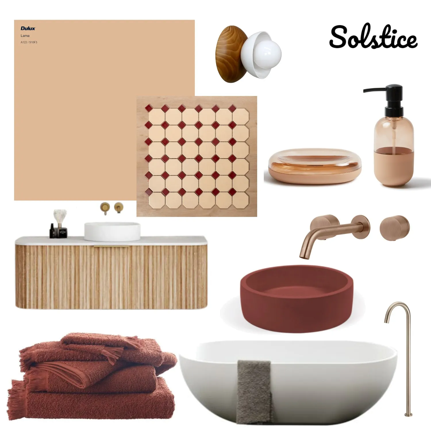
 Dulux Colour Forecast 2024 - Solstice Palette - Styling: Bree Leech | Photographer: Lisa Cohen
Understanding Colour Theory
Colour theory is both the art and science behind choosing the perfect palette, and there’s a few key elements to familiarise yourself with before we jump into the aesthetics:
The Colour Wheel
The colour wheel is a visual tool that helps you understand how colours relate to each other and how they can be combined effectively. There are four common types of colour schemes:
1. Monochromatic - The variation of one colour, creating a versatile palette for your space.
2. Complementary - Situated on opposite sides of the wheel and when used together, they give off a vibrant appearance.
3. Analogous - Sometimes referred to as harmonious, this is a contrasting scheme that involves the use of colours that are located side by side on the colour wheel.
4. Triadic - Three different colours that are evenly spaced on the colour wheel.
Tip: The best way to familiarise yourself with the colour wheel is to use an interactive tool, like this one.
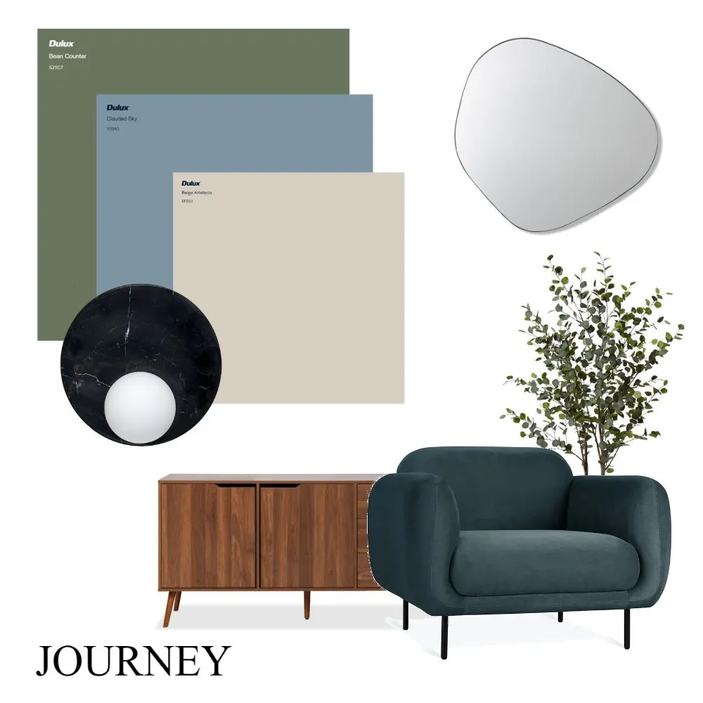
 Dulux Colour Forecast 2024 - Journey Palette - Styling: Bree Leech | Photographer: Lisa Cohen
 Dulux Colour Forecast 2024 - Journey Palette - Styling: Bree Leech | Photographer: Lisa Cohen
Warm Tones Vs Cool Tones
Everything within your home, from your bench tops to your cushions and, of course, paint, will have undertones of either warm or cool. Warmer tones are those fiery reds, oranges and yellows, whereas cooler tones are those soothing blues, greens and purples.
Tip: Neutrals can be either warm or cool toned, so they often need a bit more consideration.
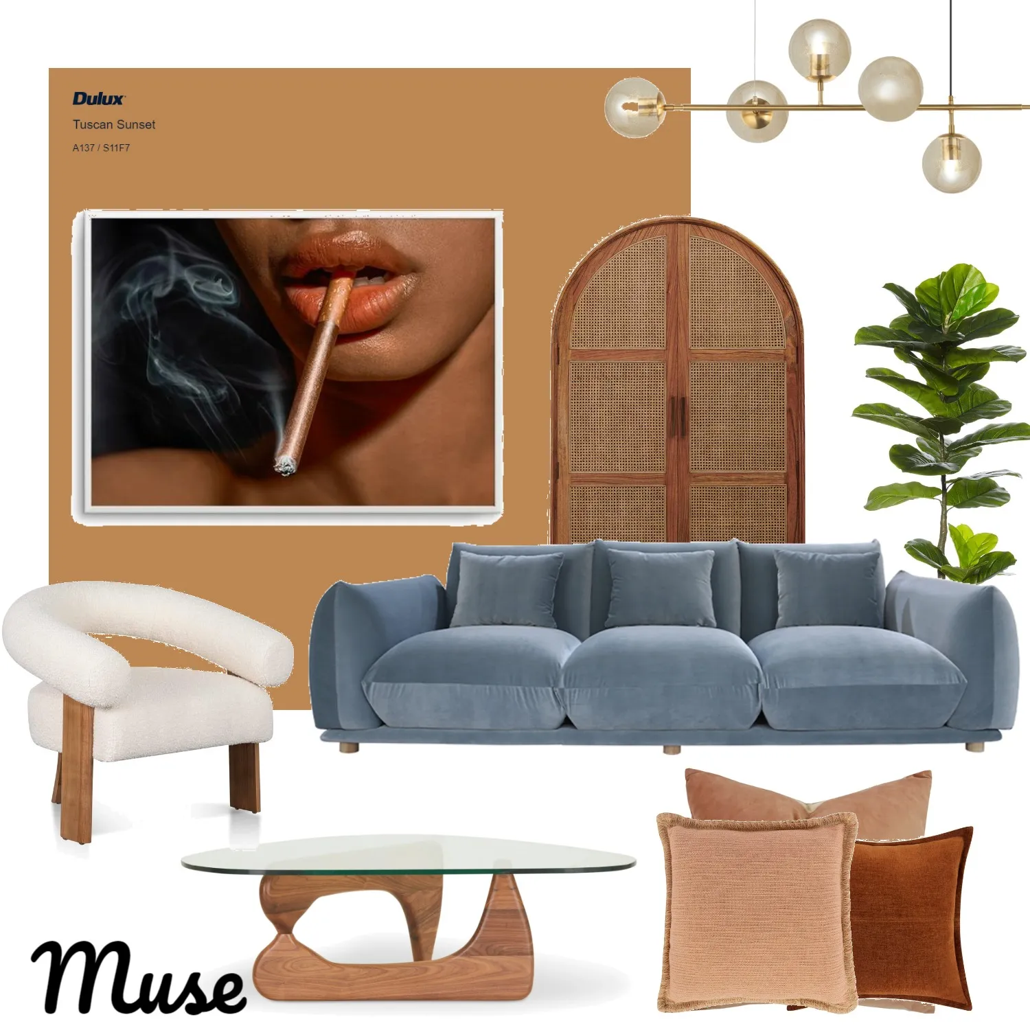
 Dulux Colour Forecast 2024 - Muse Palette - Styling: Bree Leech | Photographer: Lisa Cohen
Shades, Tints and Tones
It’s also important to know a few key terms to help find the perfect palette. For example, the shade and tint of colour refer to the hue’s light or darkness. Adding black to a colour alters the shade, whereas the tint is altered by adding white. Tones are produced by mixing a colour with grey, altering both the shade and tint.
So, now you’ve got the theory down, we’ve compiled a few of our favourite palette concepts for a bit of inspiration (plus the latest trends, of course).
 Dulux Colour Forecast 2024 - Solstice Palette - Styling: Bree Leech | Photographer: Lisa Cohen
 Dulux Colour Forecast 2024 - Solstice Palette - Styling: Bree Leech | Photographer: Lisa Cohen
Dulux Colour Forecast 2024
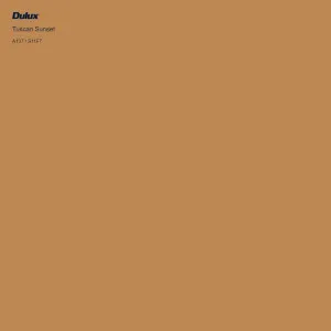
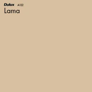
We couldn’t discuss the perfect palette without diving into the 2024 Dulux Colour Forecast. This year’s colour trends reflect a gorgeous grounded palette that promotes positivity and nurturing within the home with influences taken from across the globe. Solstice, Muse and Journey feature warm colours with a yellow inference, pink-influenced clay hues and reddy browns, olive green and accents of pale blue and zesty yellow.
We’re slightly obsessed with these palettes as they perfectly encapsulate the earthy interiors and nostalgia that has taken over the design industry lately. Plus, the pops of colour add an extra layer of exciting depth which we can’t wait to see play out in your mood boards and real-life projects.
 Mood board created by Peach and Willow Design on Style Sourcebook. View mood board here.
 Mood board created by Peach and Willow Design on Style Sourcebook. View mood board here.
 Dulux Colour Forecast 2024 - Solstice Palette - Styling: Bree Leech | Photographer: Lisa Cohen
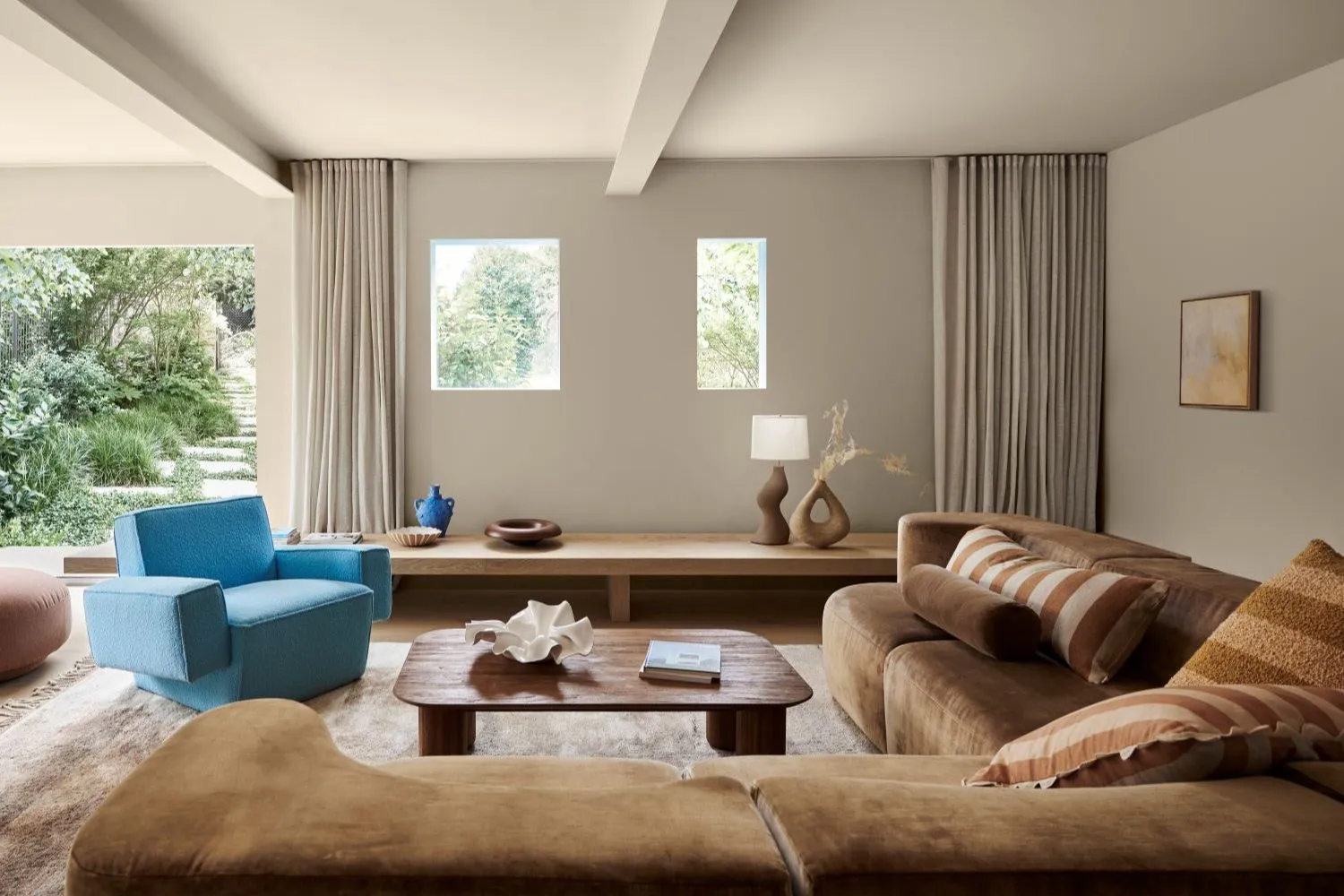
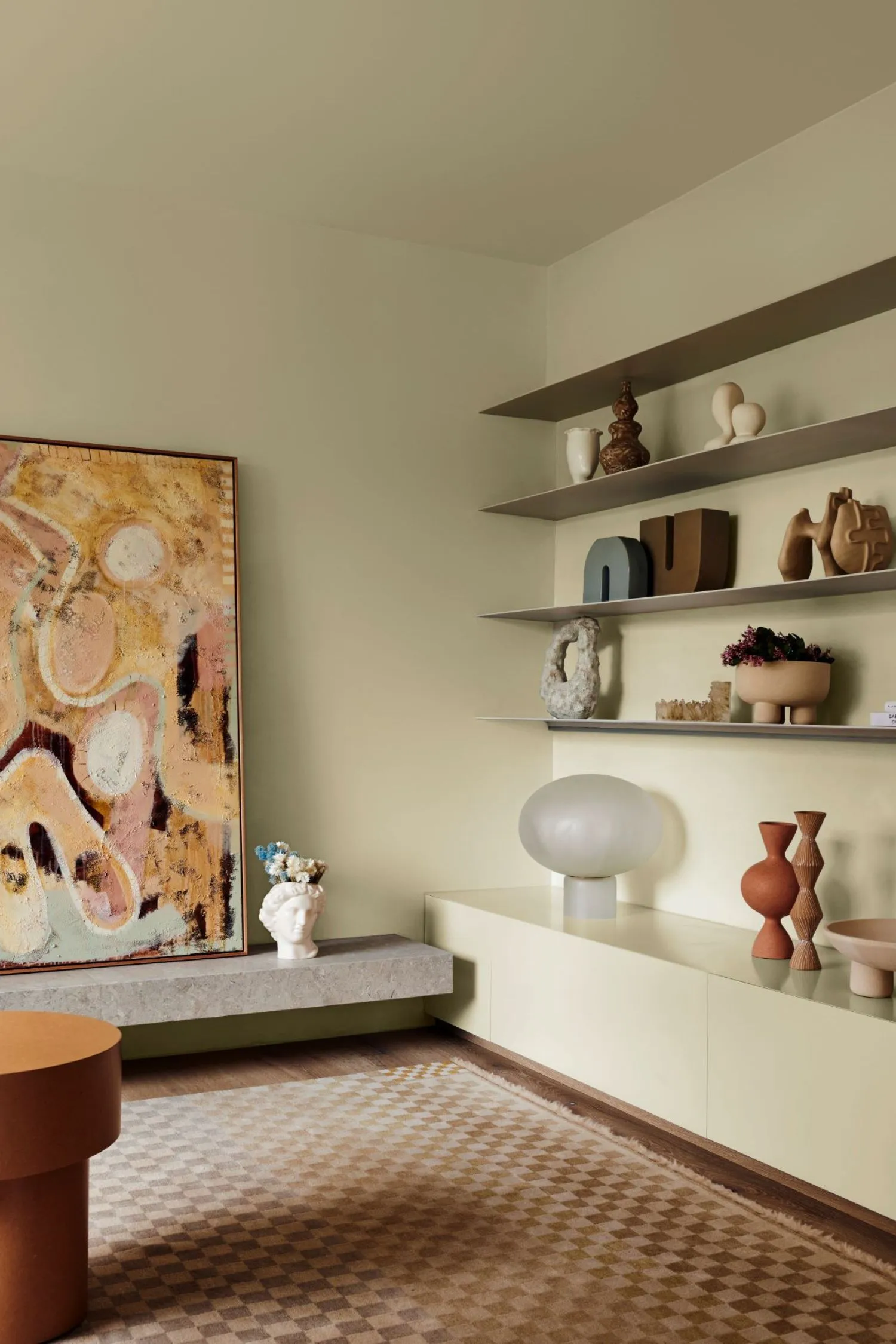
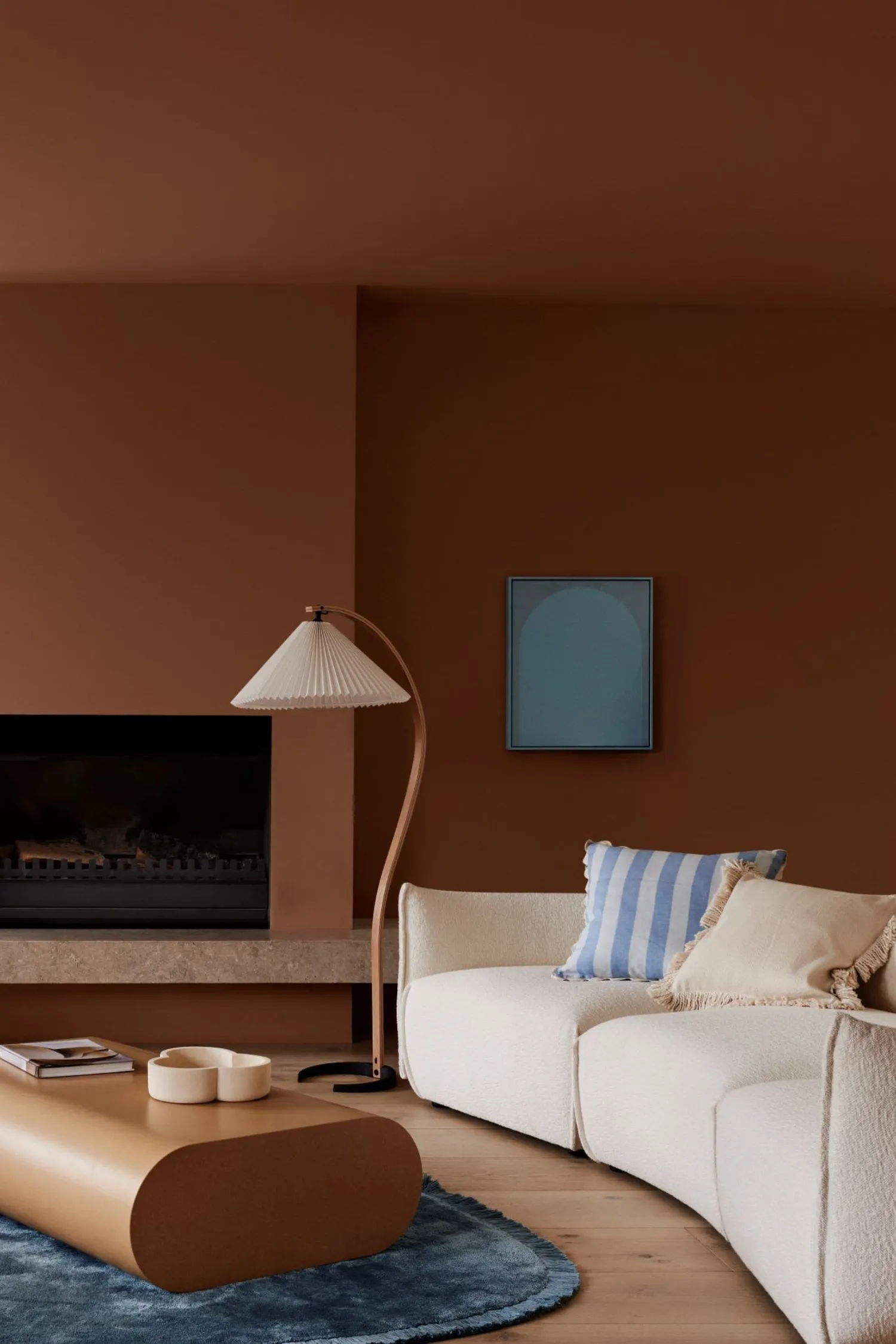
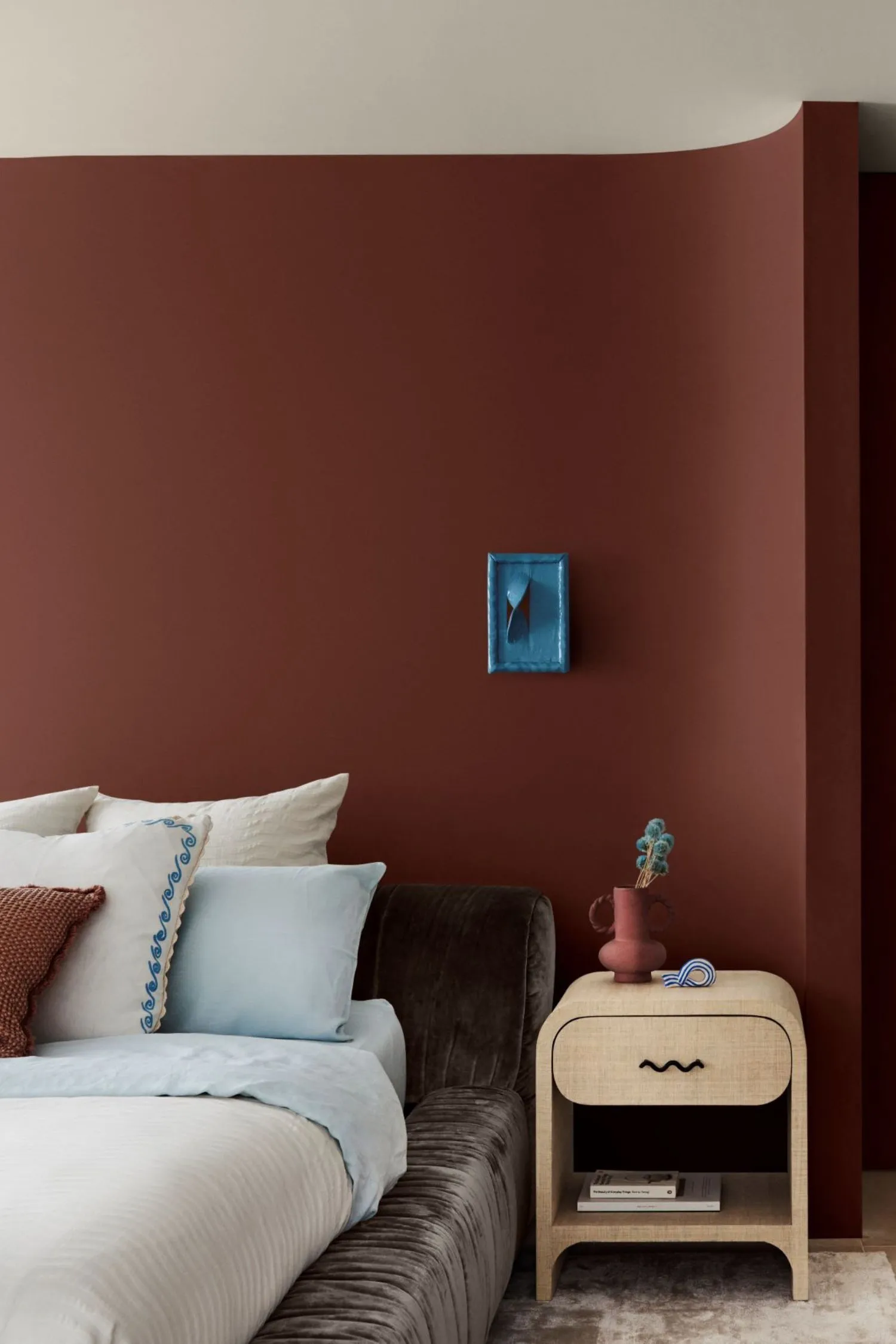
Earthy Palettes
We love all palettes, but there’s something so special about an earthy palette. Maybe it’s the grounded feeling brought in by the organic tones, or the richness that comes through the browns, reds and ivorys. But what we do know is that this palette is perfect for your home if you’re looking to achieve that warm, comforting feel the moment you step through the door.
Key Colours of an Earthy Palette - Browns, reds, greys, greens and off whites
The Inspiration - Anything organic with warm undertones
 Dulux Colour Forecast 2024 - Muse Palette - Styling: Bree Leech | Photographer: Lisa Cohen
 Dulux Colour Forecast 2024 - Muse Palette - Styling: Bree Leech | Photographer: Lisa Cohen
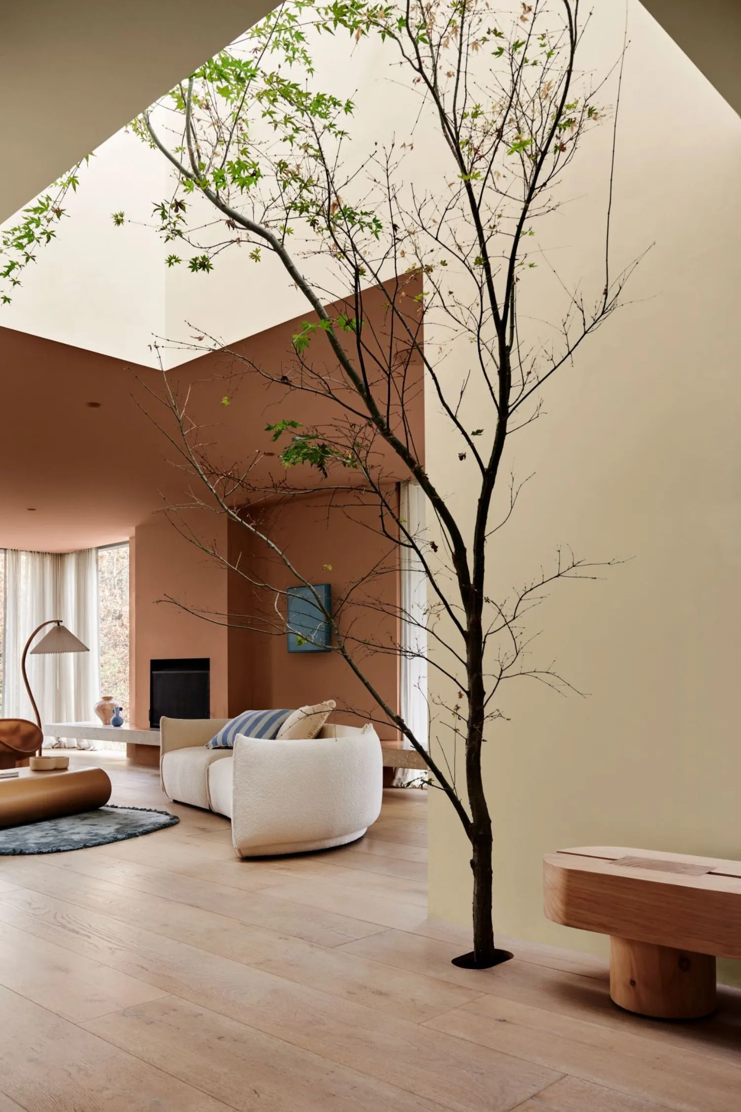
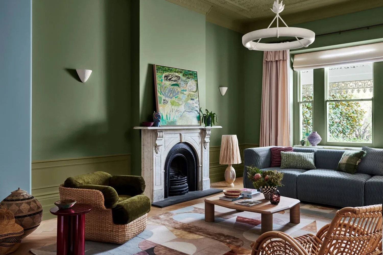
Light Palettes
Light palettes are suited to a lot of popular styles, such as coastal, Hamptons, and modern. Comprised of cool tones, these hues are perfect for creating a home that is soft, tranquil and fresh feeling.
Key Colours of a Light Palette - Whites, blues, greys, greens and pinks
The Inspiration - Lately we’re loving feminine interiors with a light palette
 Dulux Colour Forecast 2024 - Journey Palette - Styling: Bree Leech | Photographer: Lisa Cohen
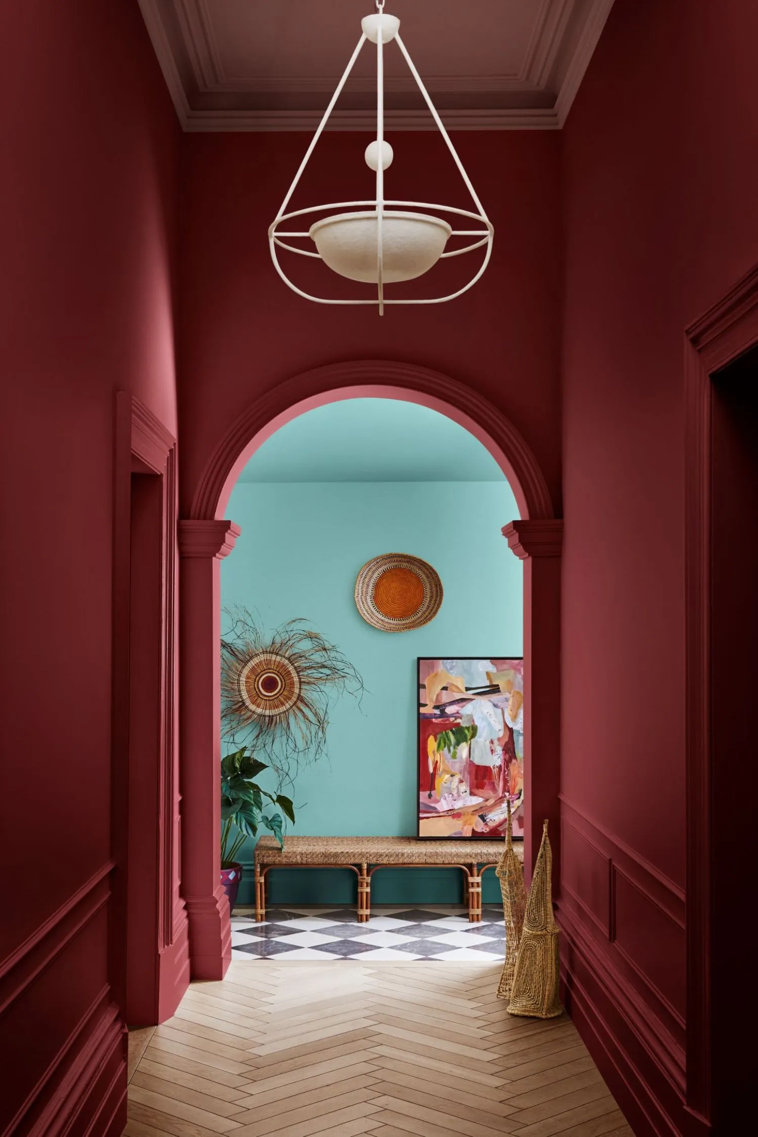
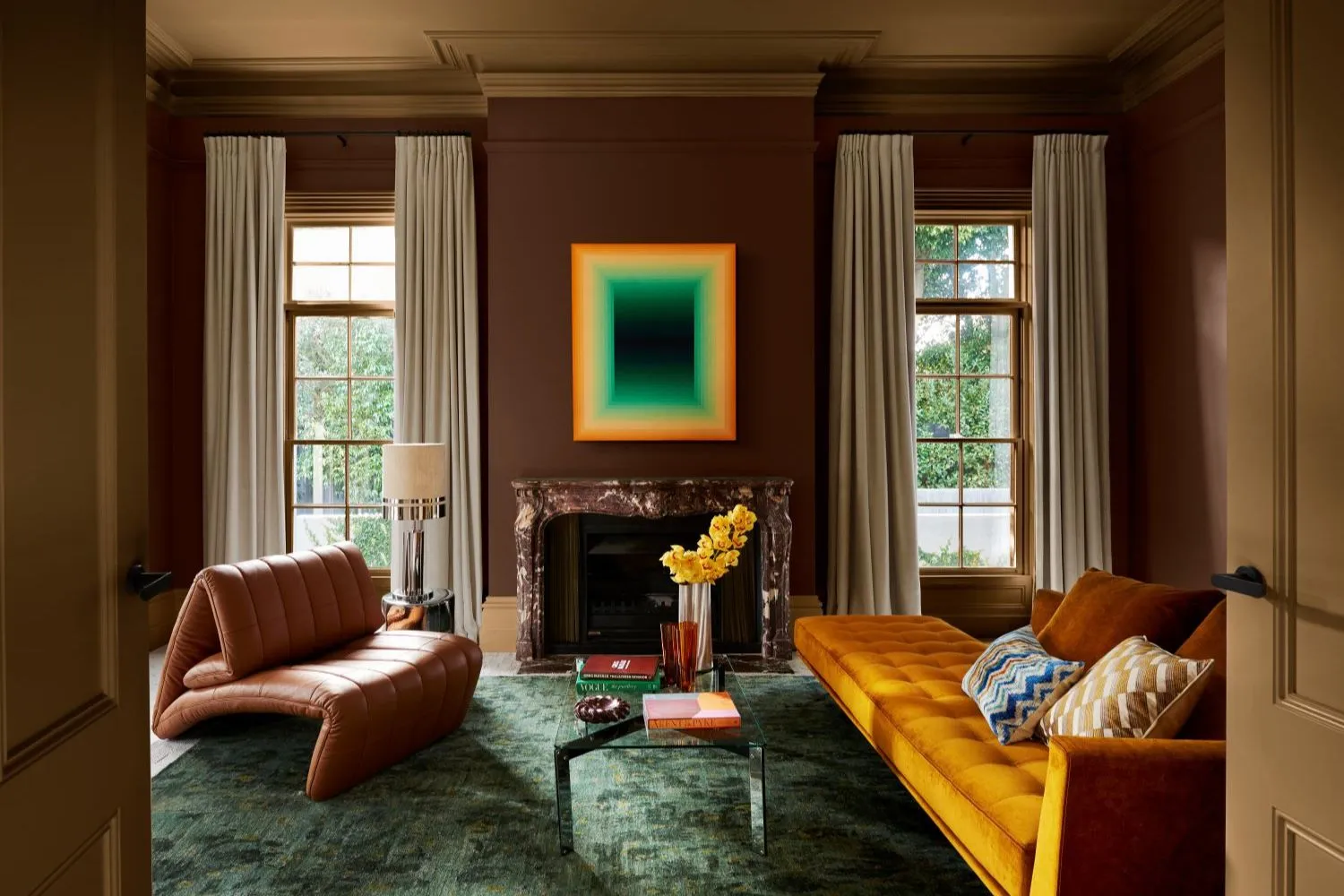
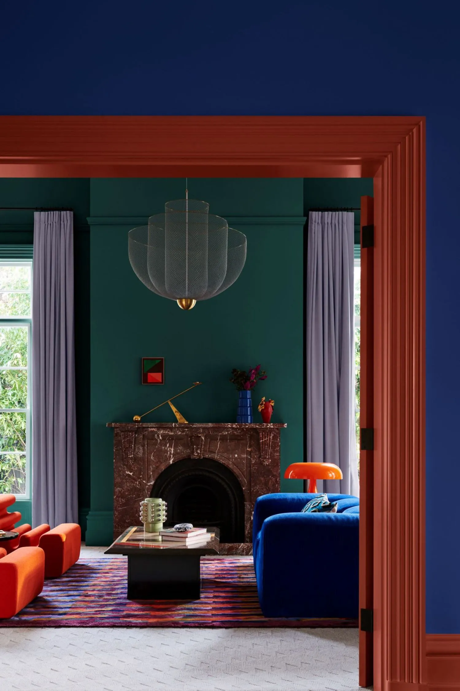
Moody Palettes
Moody palettes have been avoided in the past as they can be a little trickier, but when done right, they can completely elevate your home. Often found within modern and contemporary homes, moody palettes are rich in both colour and emotion.
Key Colours of a Moody Palette - Dark blues, reds, purples, black and greys
The Inspiration - Creating a sleek interior with a sophisticated, masculine feel
 Dulux Colour Forecast 2024 - Solstice Palette - Styling: Bree Leech | Photographer: Lisa Cohen
 Dulux Colour Forecast 2024 - Solstice Palette - Styling: Bree Leech | Photographer: Lisa Cohen
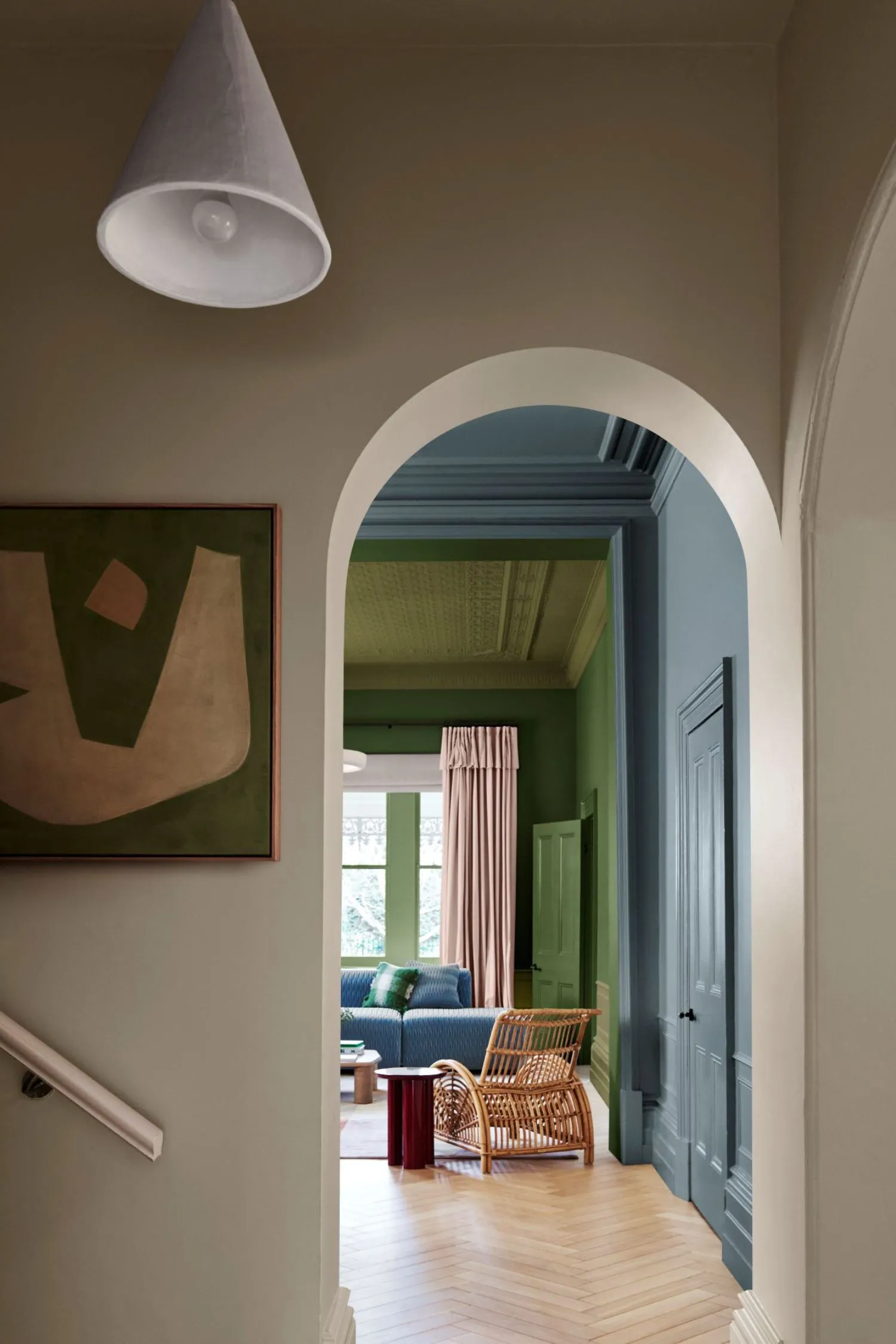
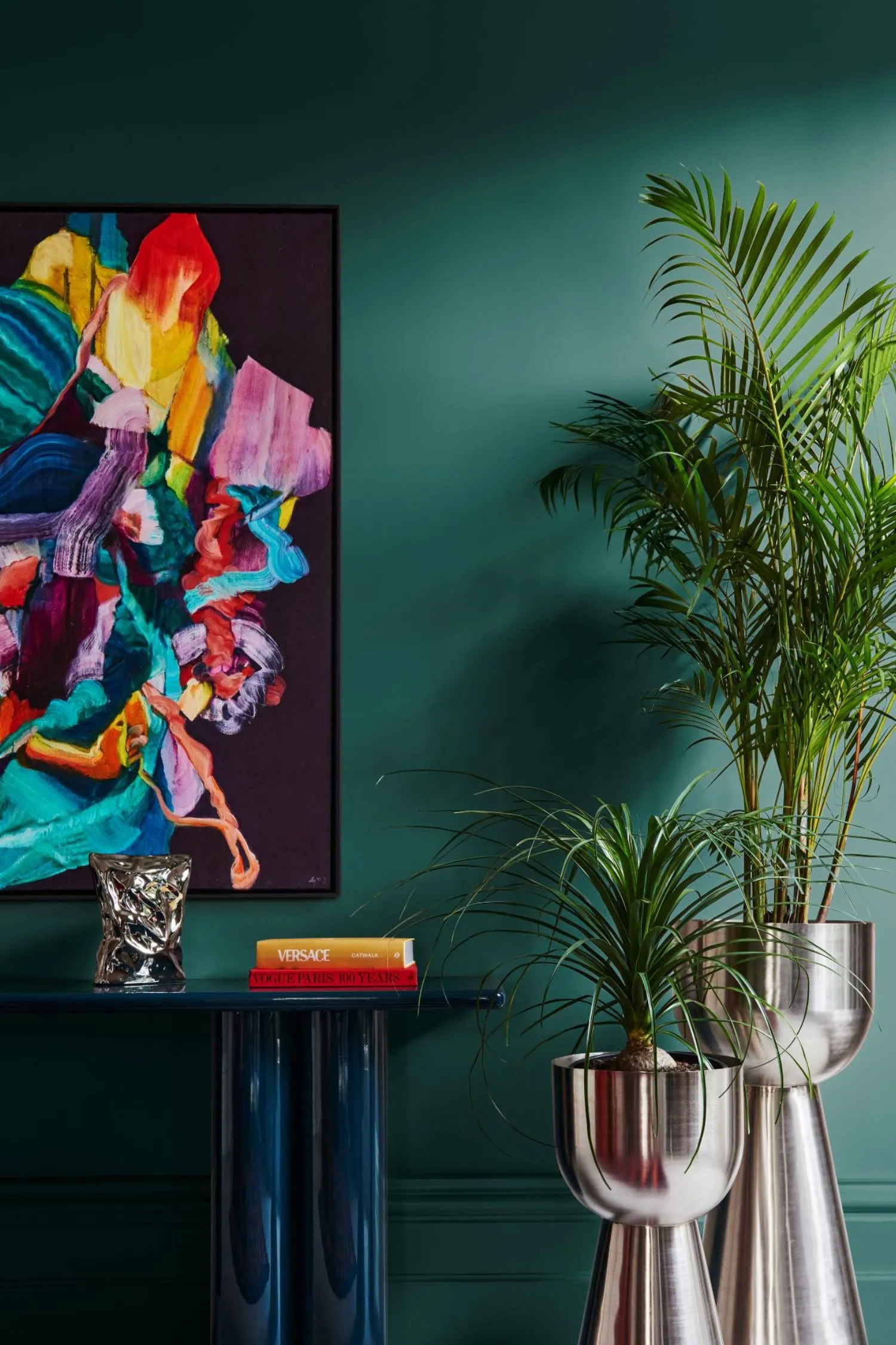
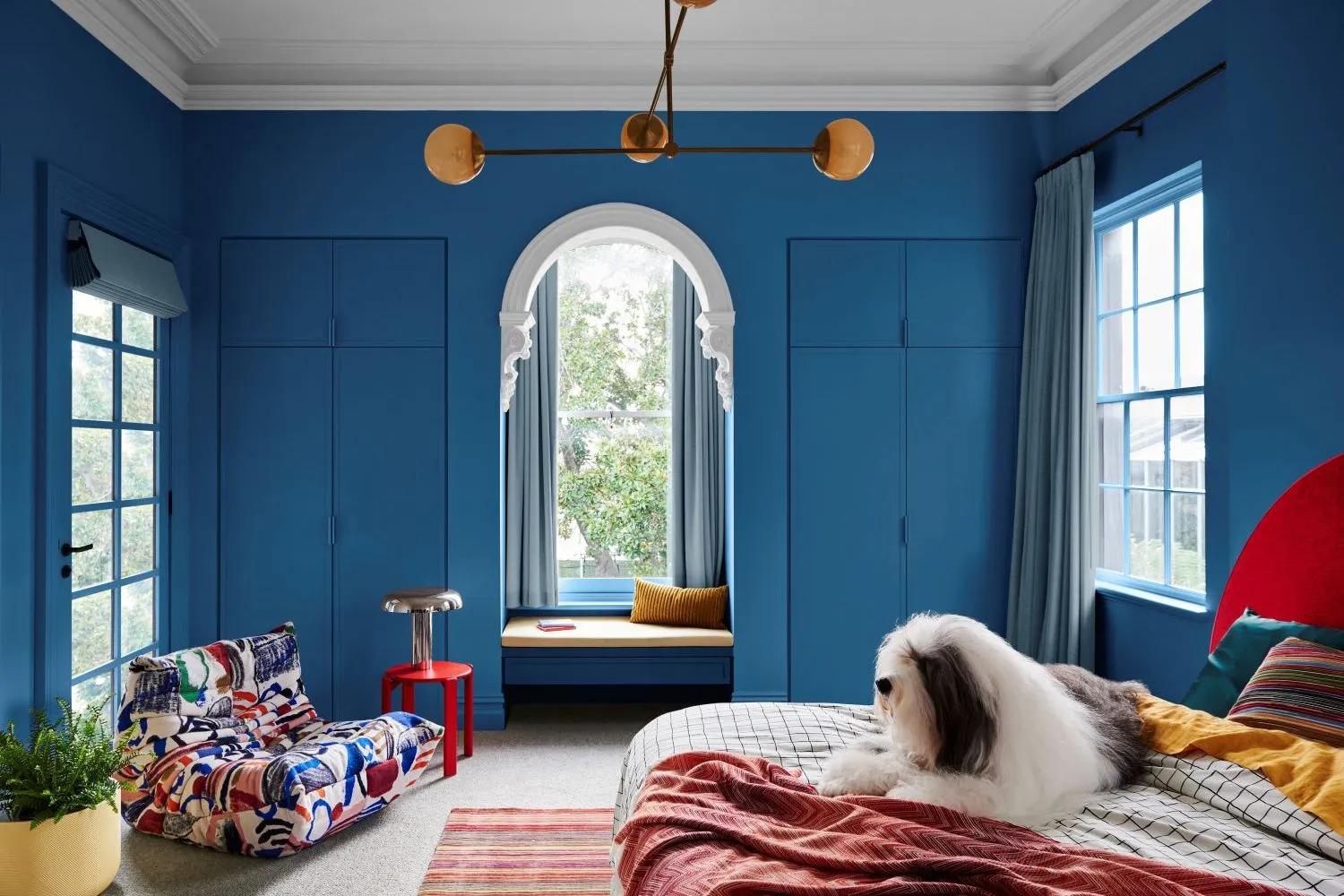
Vibrant Palettes
Vibrant palettes have weaved in and out of trends for years. We can thank maximalism for the reappearance of vibrant colours within our interiors. This palette is perfect for achieving a bright, bold space that feels fun and fresh.
Key Colours of a Vibrant Palette - Greens, blue, yellow and pinks
The Inspiration - Take note from European artists and designers, who are paving the way for vibrant interiors
 Dulux Colour Forecast 2024 - Muse Palette - Styling: Bree Leech | Photographer: Lisa Cohen
We hope our guide has you excited and inspired to find the perfect palette for your home. If you’re looking for more inspiration, check out our design community’s mood boards which are filled with a gorgeous array of colours and tones for every space.