The Latest
How To Find Your Style with Steve Cordony and Brickworks
In Partnership With: Brickworks
Style Sourcebook Profile: Brickworks
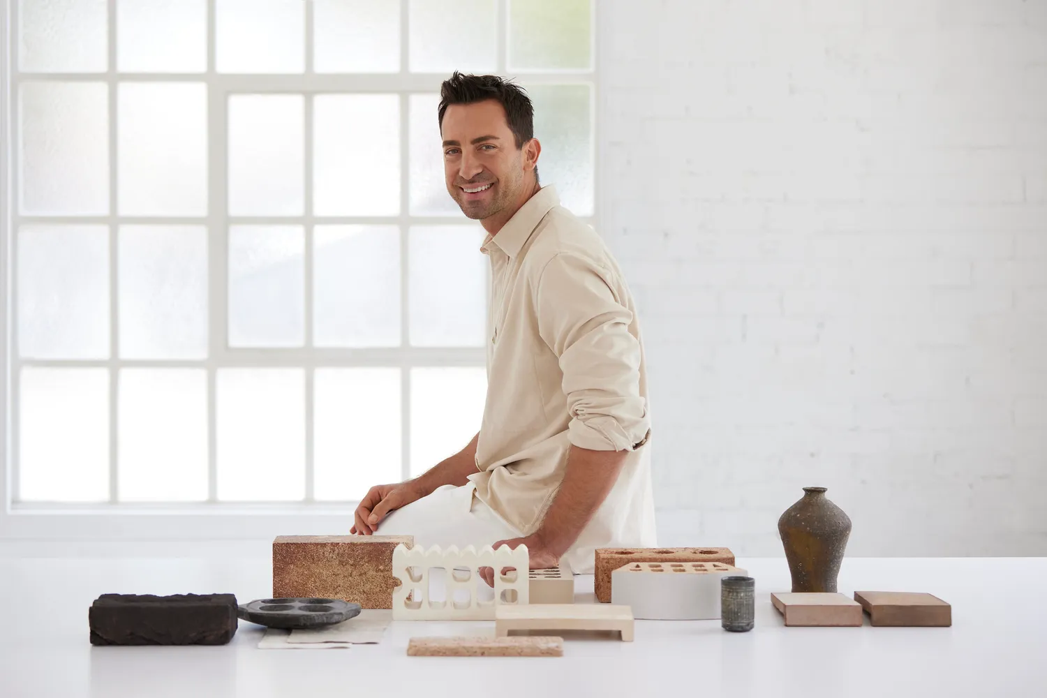
If there is one person who knows style inside and out, it’s one of Australia’s leading stylists, Steve Cordony. And if there is one brand who knows exteriors inside and out, it’s Brickworks. This makes them the perfect duo to offer some much-needed styling advice when it comes to all things exterior styling.
If you aren’t already familiar with Steve Cordony (let’s, be honest, if you love interior design then we’re sure you would have stumbled across his work before), Steve is known for his charming and French-inspired interior and home style. You may have scrolled through images of his jaw-dropping Rosedale Farm property on Instagram or seen him in the pages of Belle Magazine for his role as the magazine’s style director. Steve really does have an expert eye when it comes to all things home style, and, in collaboration with Brickworks, we’re excited to share with you some of his top tips when it comes to exterior styling.
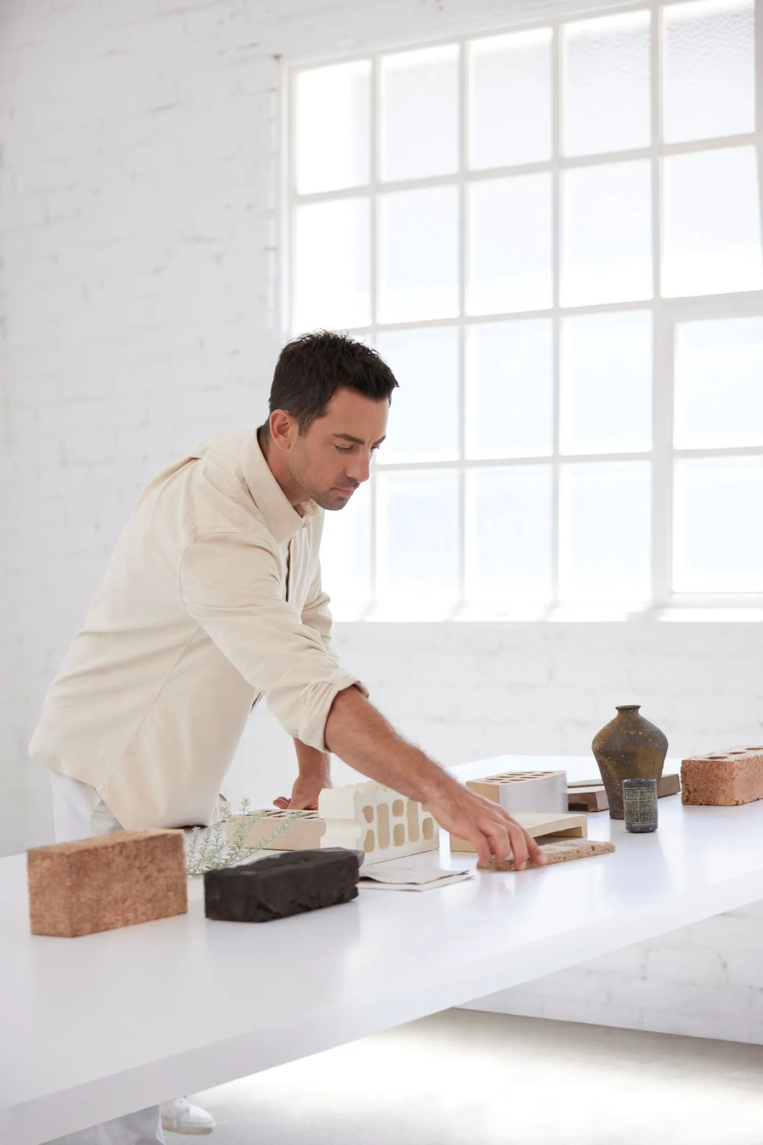
As you would probably recall from one of articles a few months ago, we showed you how to use Brickworks’ recently created House Styles as a guide to know how to choose the right house style for you (because we can all agree it can get a bit overwhelming to know where to start when designing your home). As an extension of this, we want to share with you Steve’s top tips when it comes to getting the style of your exterior just right. As part of this collaboration, Steve has created four palettes to help inspire you. Below, we share the main elements of each palette and how you can recreate each look for your very own home. We also share Steve’s top exterior styling tips to help any of you who may be in the initial stages of the design journey or are simply looking for some exterior styling inspiration.
Steve’s Palettes
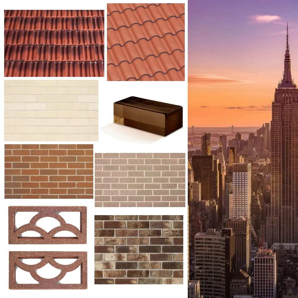
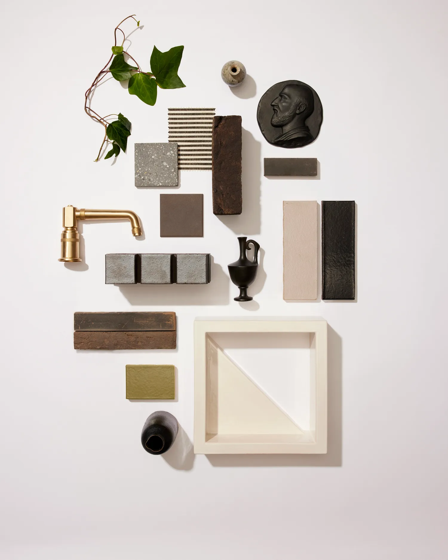
Neutral Ground
It’s no secret that we love a classic palette when it comes to both interior and exterior styling. Offering the perfect aesthetic for a timeless home, this palette will ensure your home won’t date and will withstand the test of time.
Steve recommends to “Embrace elements of the imperfect with this earthy take on understated elegance. The mixed materiality of the layered textures tells a story of warmth and feeling grounded. Tones of terracotta blend seamlessly with decorative accents such as the ornamental block and raw finishes of the selected brickwork. Lush layering of paperbark and wood create an organic direction that takes its style cues from a wabi-sabi sensibility.”
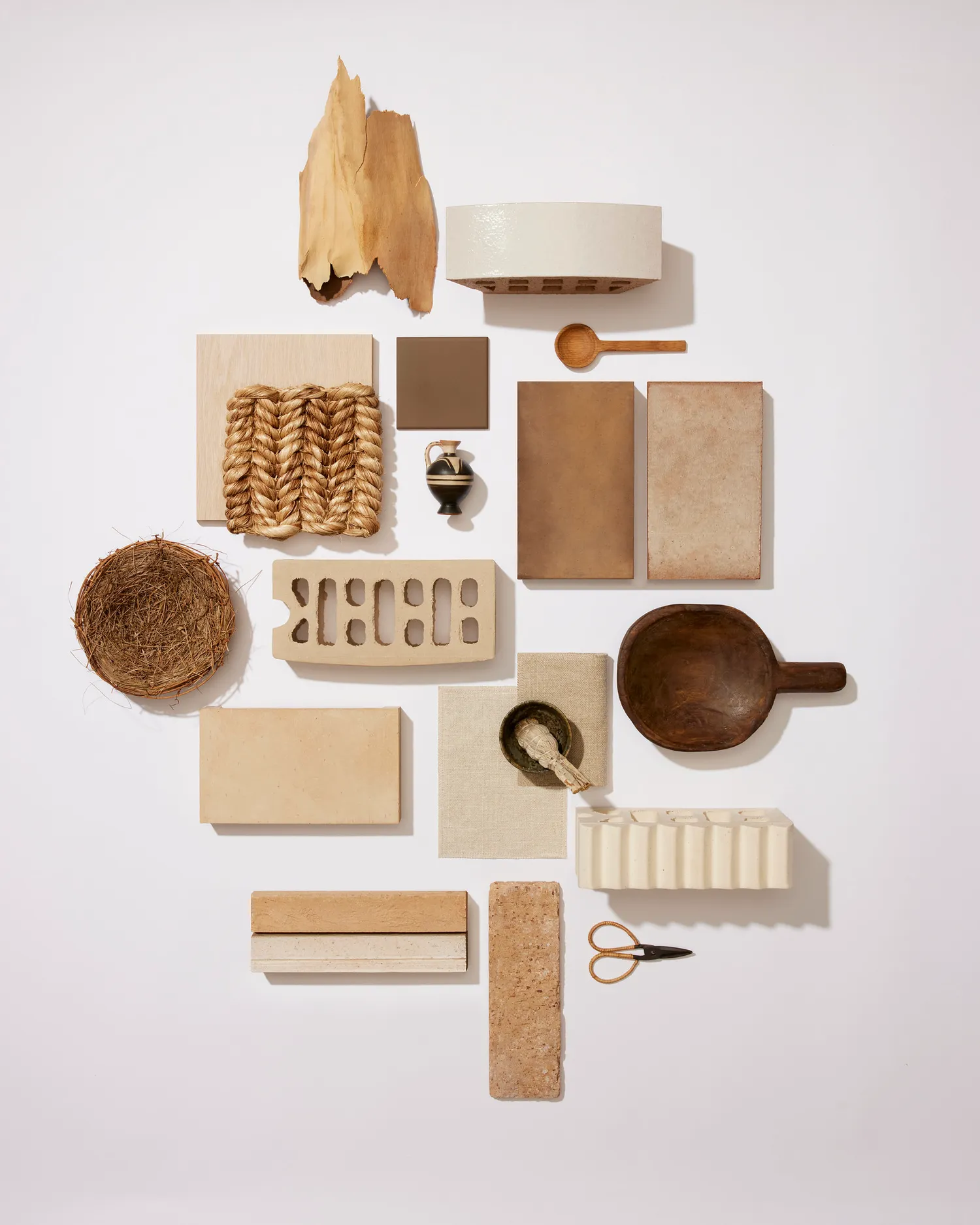 Popular products to achieve this look: San Selmo Corso Raw in Arno, Overland in Tarkine Rugged Collection and La Paloma in Miro
 View Steve Cordony's Neutral Ground mood board created on Style Sourcebook here
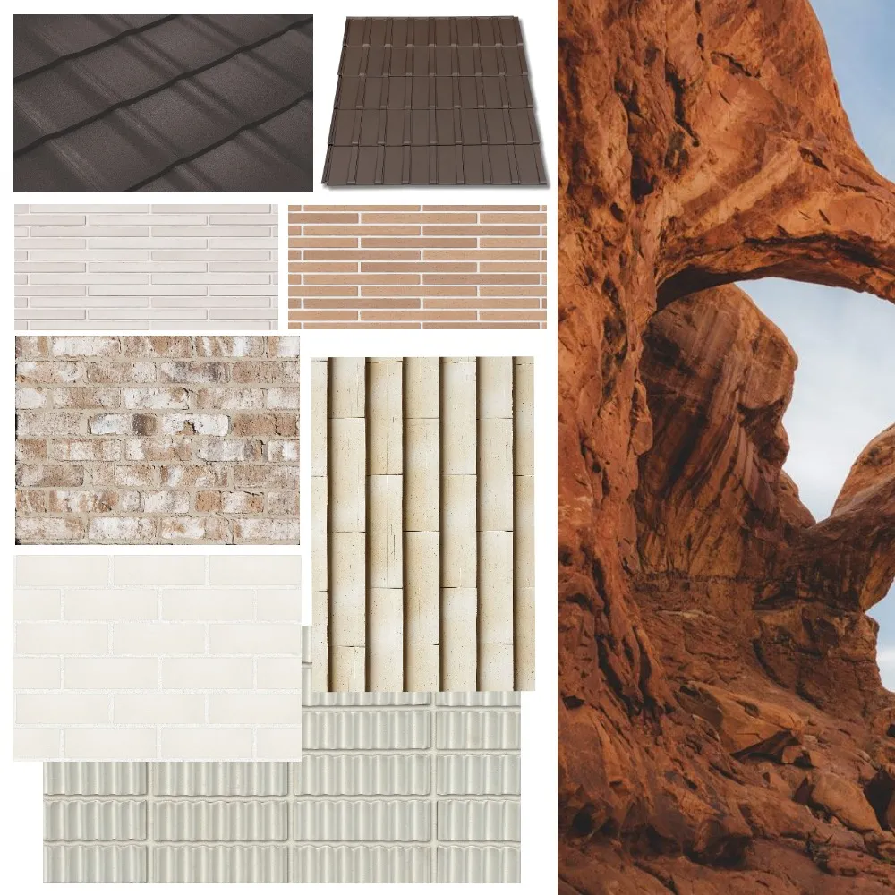
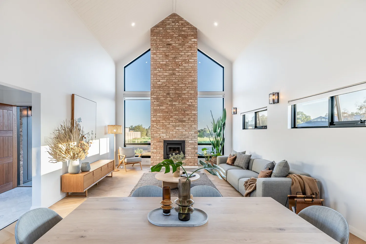
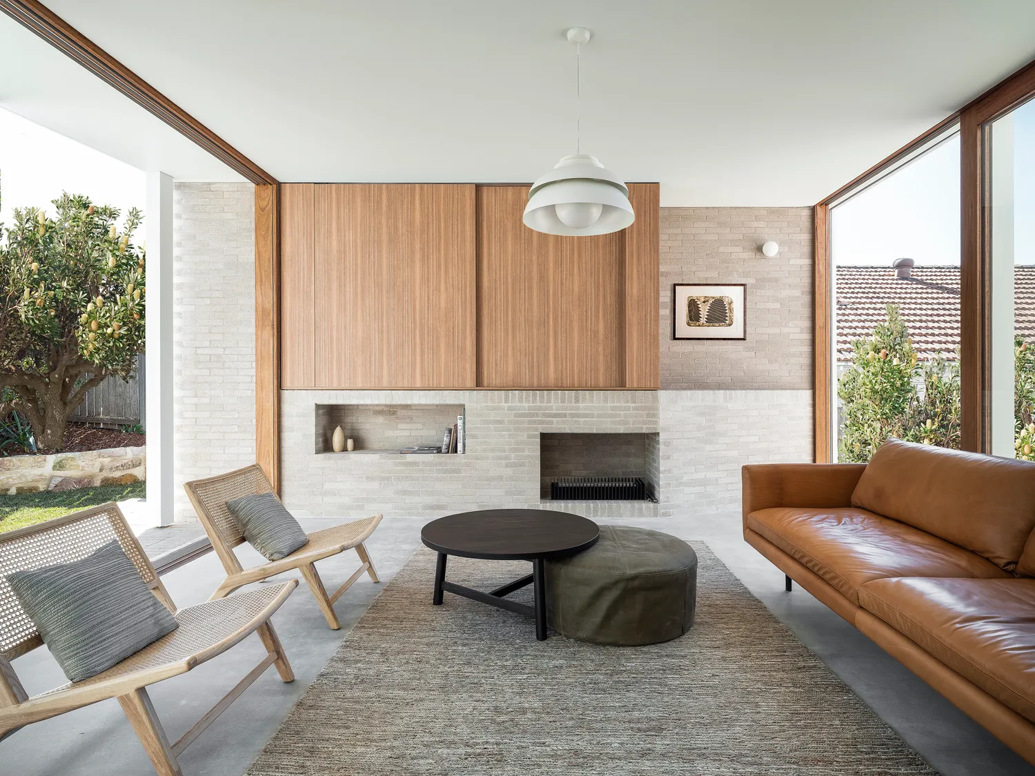
Contemporary Classic
This particular palette takes inspiration from the more contemporary exterior style, while remaining classic in tone and colour pairings. The perfect palette for either a modern farmhouse or city terrace, this palette is extremely versatile and lends itself to many different house types.
Steve shares, “Scalloped brickwork makes a statement while terracotta tones and rich, raw finishes create a symphony of texture accented by pops of bronze and charcoal”.
 View Steve Cordony's Contemporary Classic mood board created on Style Sourcebook here
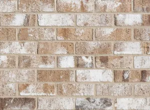
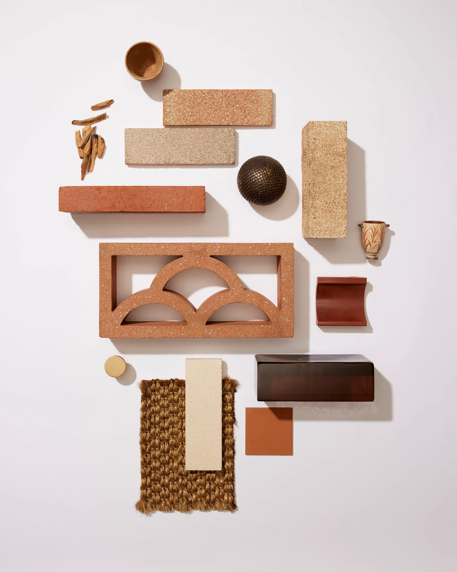 Popular products to achieve this look: Breeze Block pottery cloud breeze in pottery, Venetian Glass in Smokey Quartz Polished and Bowral Highlands brick in Woodlands
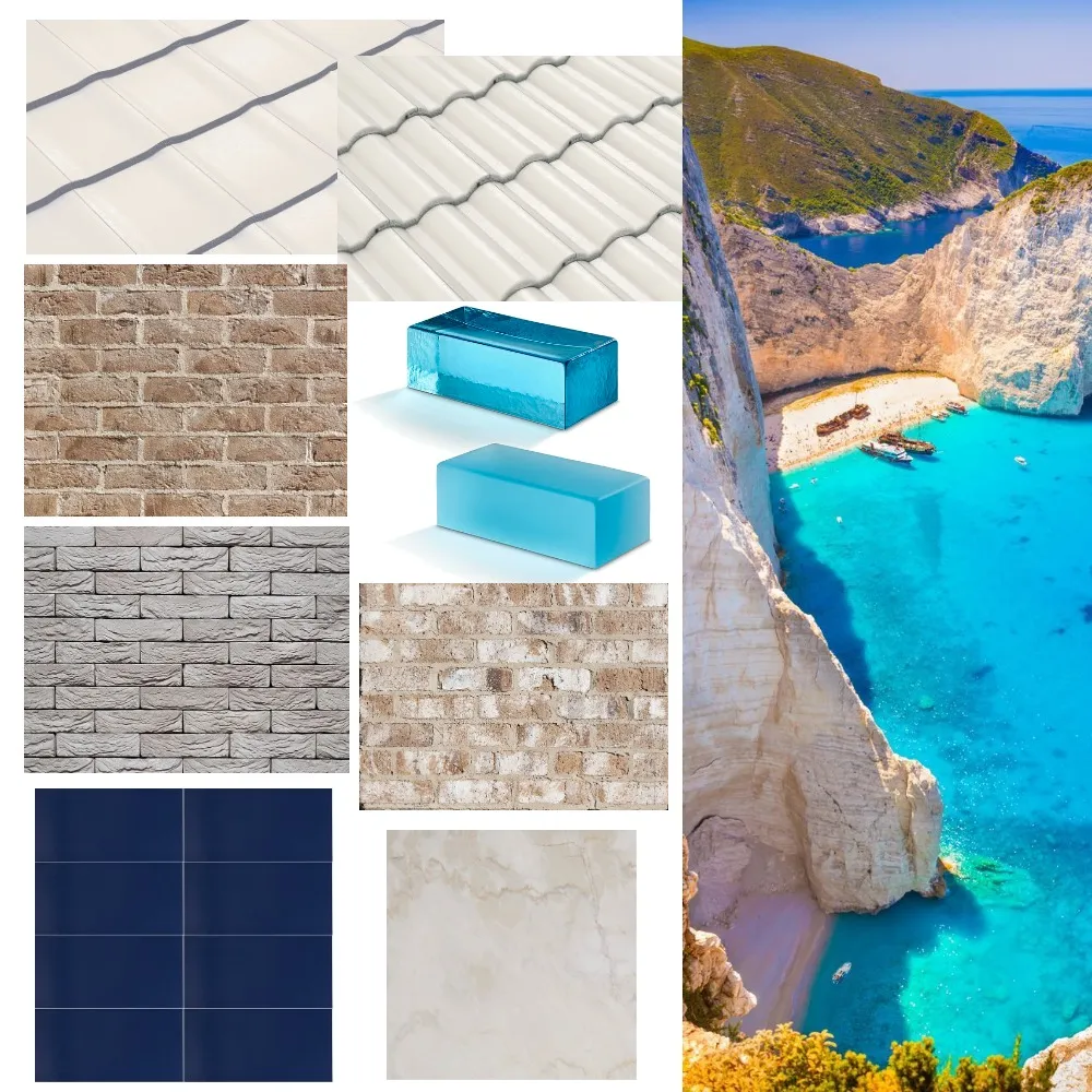
Modern Mediterranean
With inspiration taken from, you guessed it, the coastal shorelines of the Mediterranean, this palette is fresh, organic and includes rich marine-inspired accents. To describe this look, Steve explains, ”Deep, tonal additions of cobalt blue feature cladding and navy furnishings add layers of luxe while the soft, natural elements such as marble, textured brick and alabaster roof tiles add a rustic, yet classic feel to the overall look.” While a little more on the daring side, we think this palette is perfect for anyone seeking a coastal, fresh aesthetic for their home.
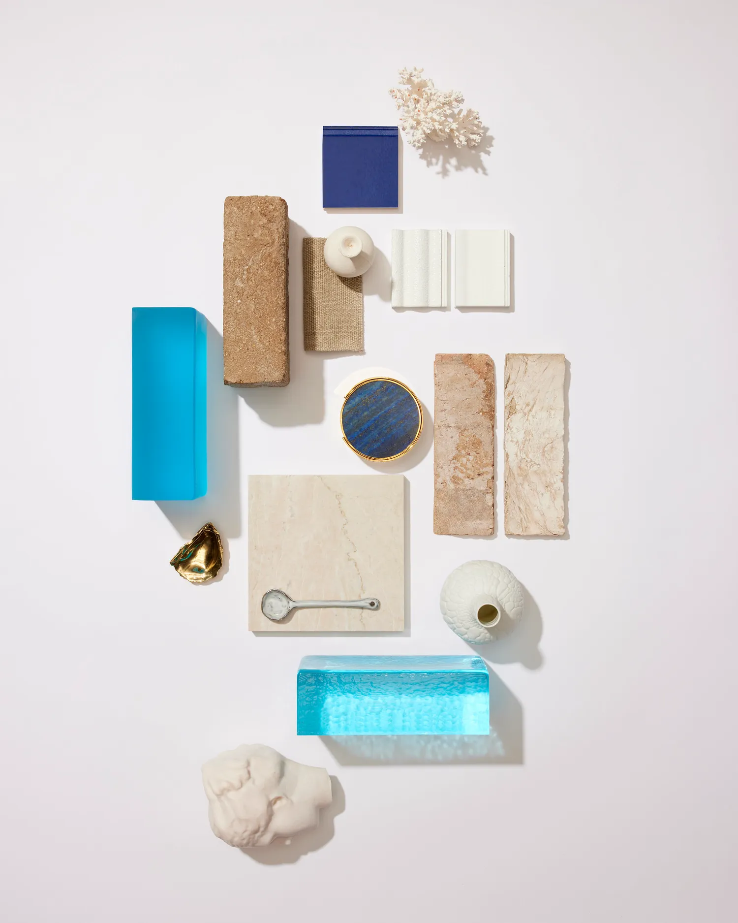 Popular products to achieve this look: Venetian Glass Acqua Marine Polished, Sculptured Sands brick in Olivine and Urbanstone Pearl Marble paving
 View Steve Cordony's Modern Mediterranean mood board created on Style Sourcebook here
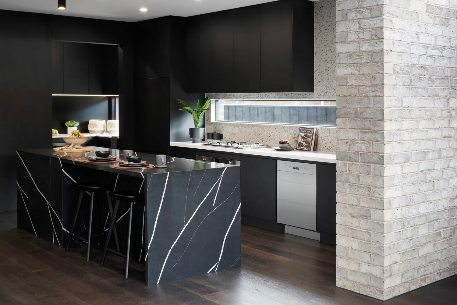
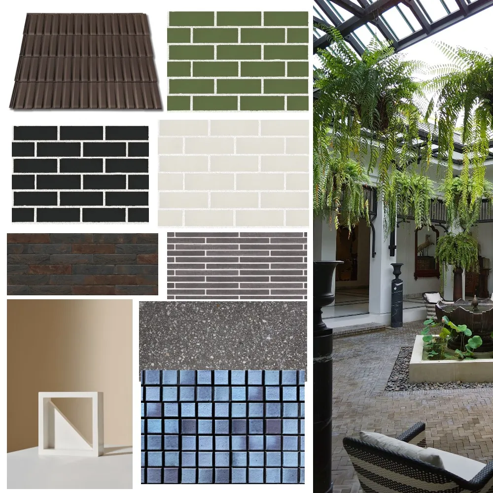
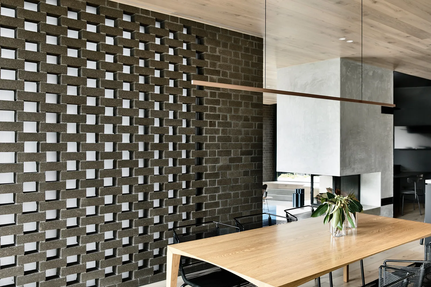
Urban Escape
A bit of a richer palette, this palette is for those who prefer a slightly darker and bolder house style. This palette suggests elements of inner-city living, all while remaining classic and sophisticated. Steve explains, “The textural shades of charcoal, chocolate and umber, accented by touches of gold and polished concrete, are lifted by the inclusion of statement materials and gentle bursts of green.”
 View Steve Cordony's Urban Escape mood board created on Style Sourcebook here
 Popular products to achieve this look: Burlesque in Deepening Green, Nelissen brick in Ypres and Kite Breeze in White Glazed
Steve’s Top Exterior Styling Tips
1. Harmony at home
The style of your house and the colours you choose go hand in hand. For example, a Hamptons home lends itself to crisp whites, a contemporary abode might look best in dramatic charcoal and a mid-century manor could lean into earth-inspired hues.
2. Palette perfection
Colour is a wonderful way of personalising your home. Building on the two or three ‘hero’ colours that you have selected, keep it simple with the introduction of complementary shades to bring balance, including through soft furnishings and accessories.
3. Natural selection
Crafting a cohesive palette of texture and tone takes consideration, but starting with natural, raw materials is a failsafe way to add depth to a space. Linen, timber, stone or brick will always deliver a subtle richness to any room.
4. The magic number
Try the 60/30/10 rule when deciding on where colour goes. The 60 per cent is the main colour, typically designated to walling and flooring, the 30 per cent is a secondary tone that supports the main, and the 10 per cent is the accent shade that serves as a contrast to your two other tones.