Interiors
The Mood is Mocha Mousse | Step Into the Season’s Most Luxurious Neutral
It’s no secret that we love neutral palettes here at Style Sourcebook, so we’re thrilled that Pantone’s Colour of the Year is Mocha Mousse. It’s warmer, deeper, and far more delicious than grey. In our opinion, this colour really makes interiors feel luxurious. You’ll be glad to know that it’s really having its design moment, and we’re here for it. So, where is it having its moments? What kind of products can you use in your projects? And, where’s the inspiration to get started? We’ve got you covered on all bases to help you create a Mocha Mousse interior dream.
Think rich espresso tones, soft caramel highlights, and velvety brown hues that feel equal parts earthy and elegant. The Mocha Mousse palette doesn’t scream for attention, but it smoulders. It’s a refined shift away from stark whites and cool greys, toward something more grounded, tactile, and cocooning.
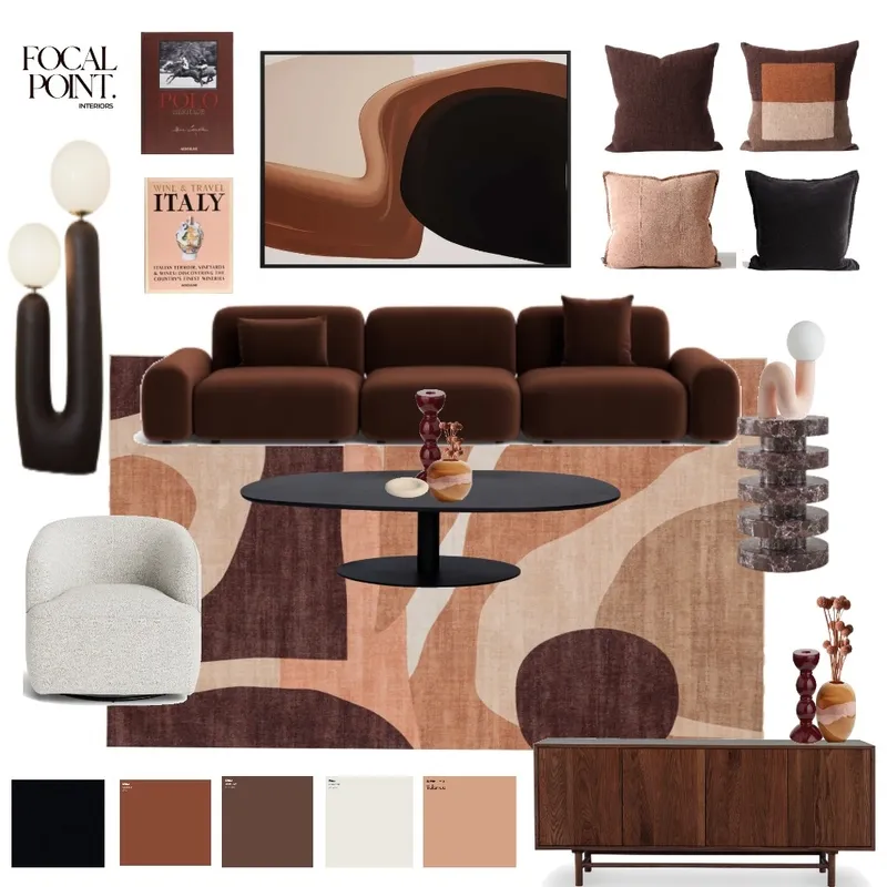
Here at Style Sourcebook, we’ve been seeing the Mocha Mousse influence pop up across mood boards, and honestly, we are in awe. From terracotta-infused lounges to walnut-toned cabinetry, designers are leaning into warmth.
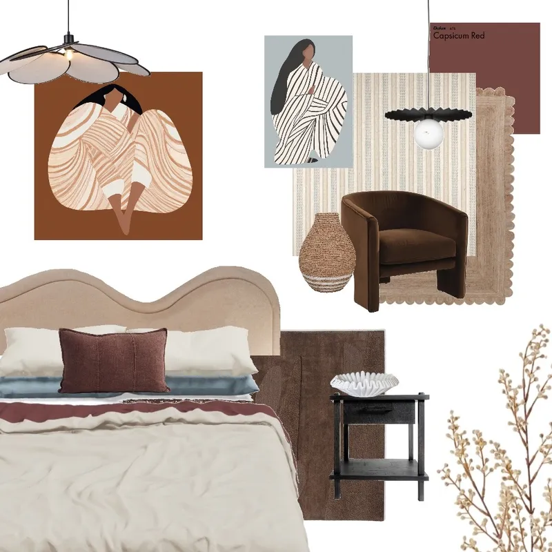
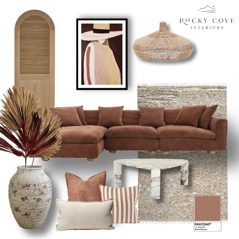
If our mood board inspiration was enough to get you started on your designs, let’s have a look at a few products that will have you motivated to begin your creative Mocha Mousse vision.
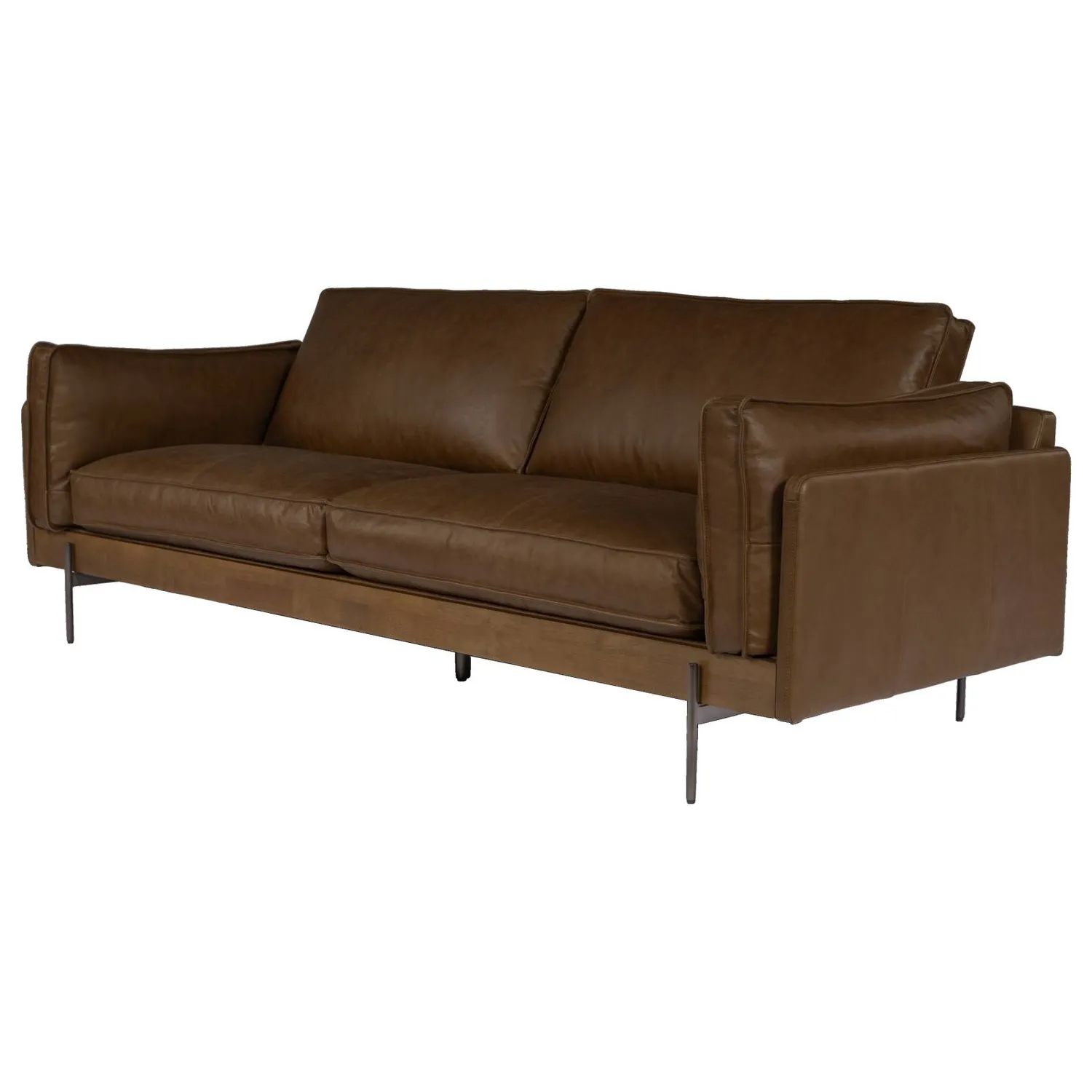
Schots Home Emporium’s mocha sofa makes the perfect anchor for a living space that wants a little depth, without going dark.
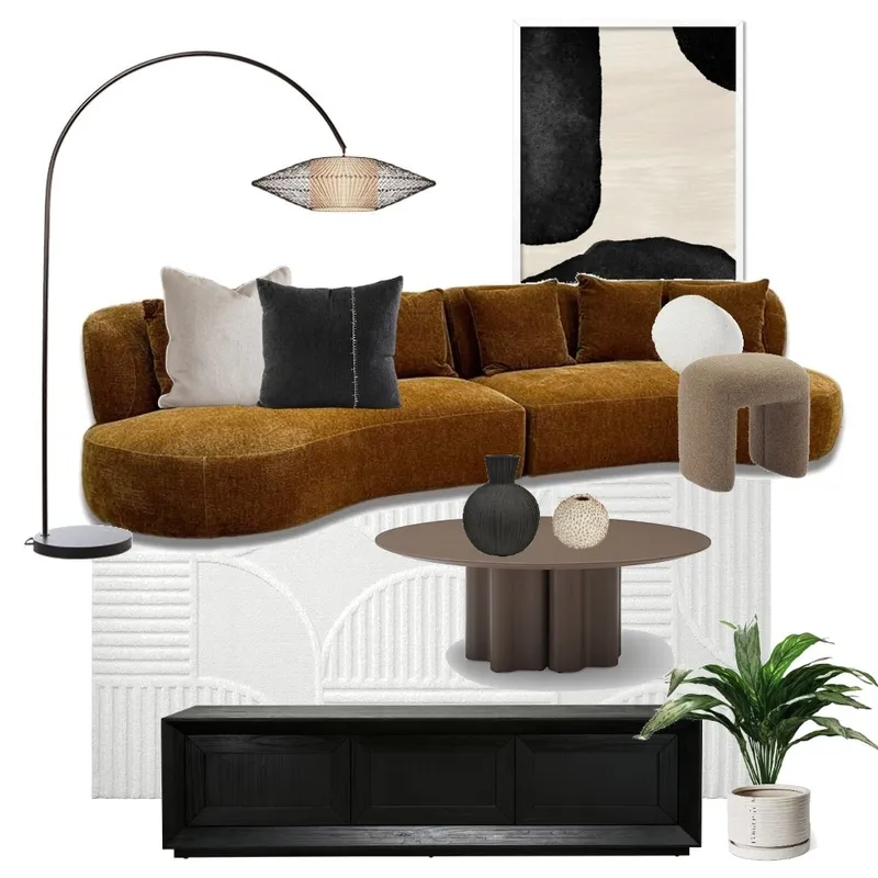
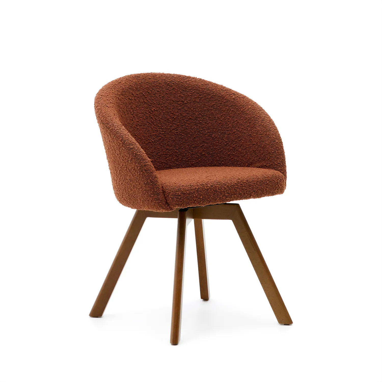
Kave Home’s swivel chair is a deep brown bouclé and balanced by walnut-finished legs, it brings the rich, layered tones of the Mocha Mousse palette to life.
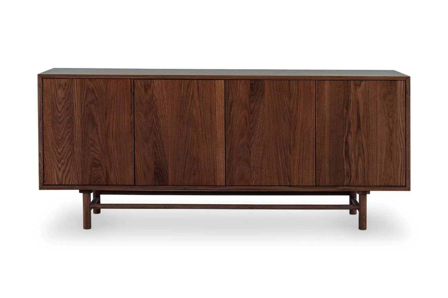
Introduce the darker, moodier tones for a Mocha Moose palette through walnut cabinets to create a homely atmosphere, such as using this Ollie Sideboard from Lounge Lovers.
Whether you're curating a space that’s sun-drenched and coastal, or you’re drawn to a more urban, moody sophistication, this palette meets you there. It’s timeless. It’s textural. What are the best colours to pair Mocha Mousse with?
If you want the space to feel open and airy, pairing Mocha Mousse with off-whites and creamy tones creates a light-filled palette, which feels timeless.
There’s no doubt that warm metallics complement mocha mouse stunningly, so how exactly can you elevate Mocha Mousse’s earthy richness? Use accents of brass, copper and gold across light fixtures and decorative accessories to add some glamour to the room.
If you’re feeling bold, rich jewel tones make the space feel even more luxurious when paired with Mocha Mousse tones. Think sapphire blues, deep greens and garnet reds - trust us, it works.
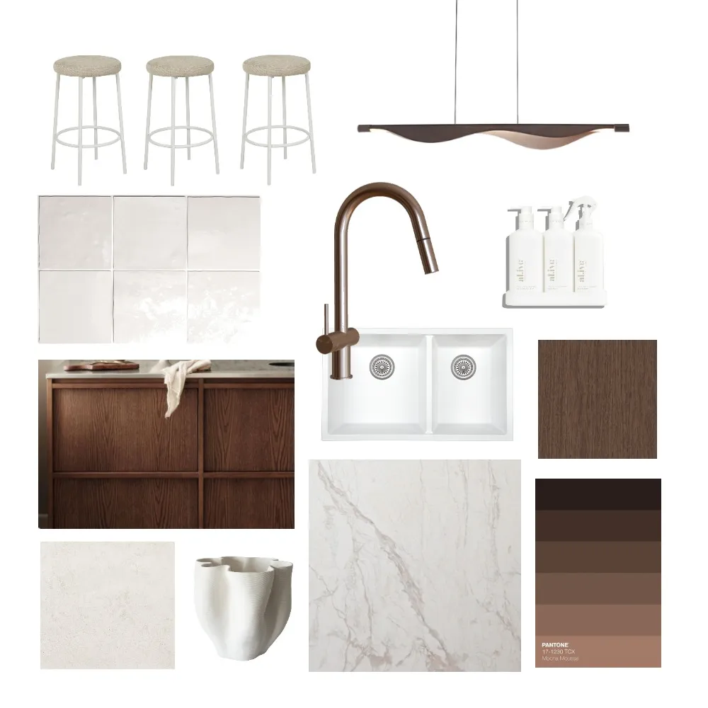
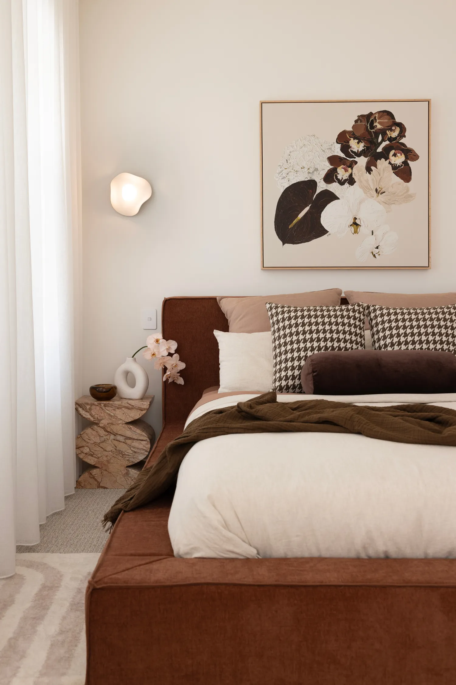
If you didn’t have enough inspiration already, let’s have a look at how designers are using the Mocha Mousse palette in their projects. You’ve probably seen Sarah Ellison’s iconic styling lead the way with these kinds of tones with her project 3 Rooms Syndey. Those sun-kissed timbers, burnt toffee velvets, and sandy ceramics all live beautifully within this spectrum. It’s a palette that photographs like a dream but lives even better, and we’re thrilled to have already seen how tastefully these designs came to life.
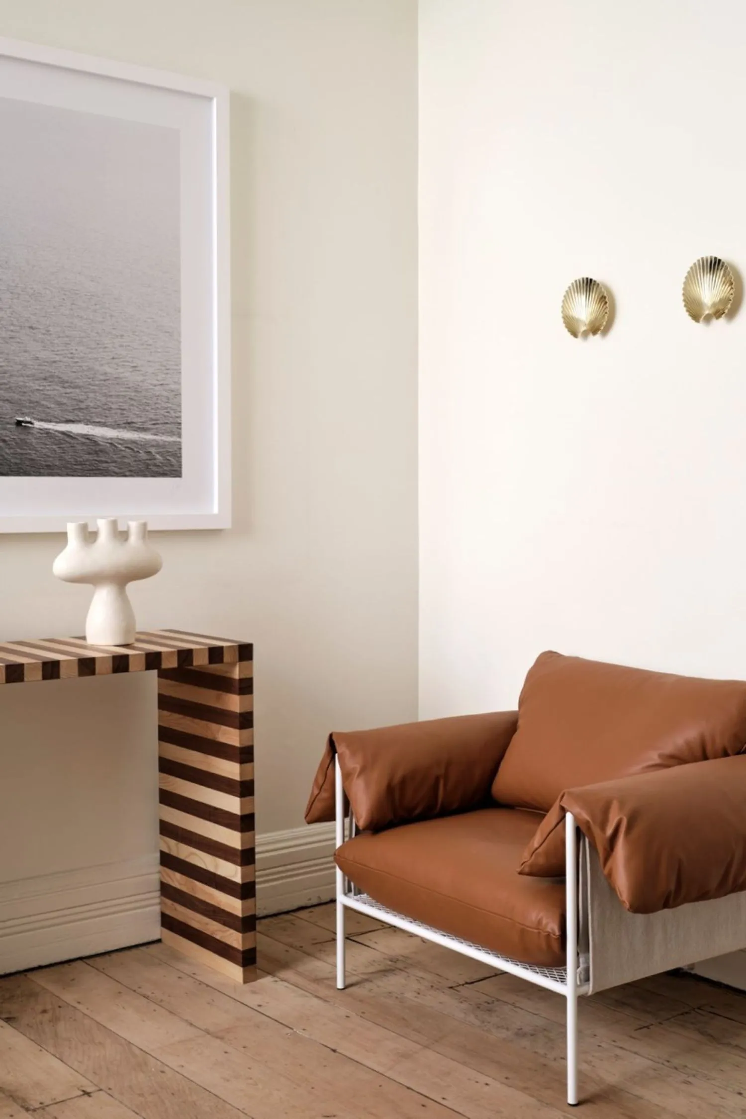
Design: Sarah Ellison
Design: Sarah Ellison
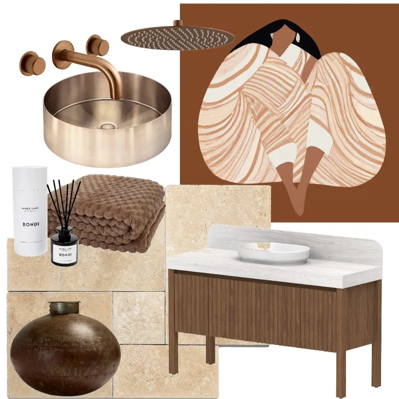
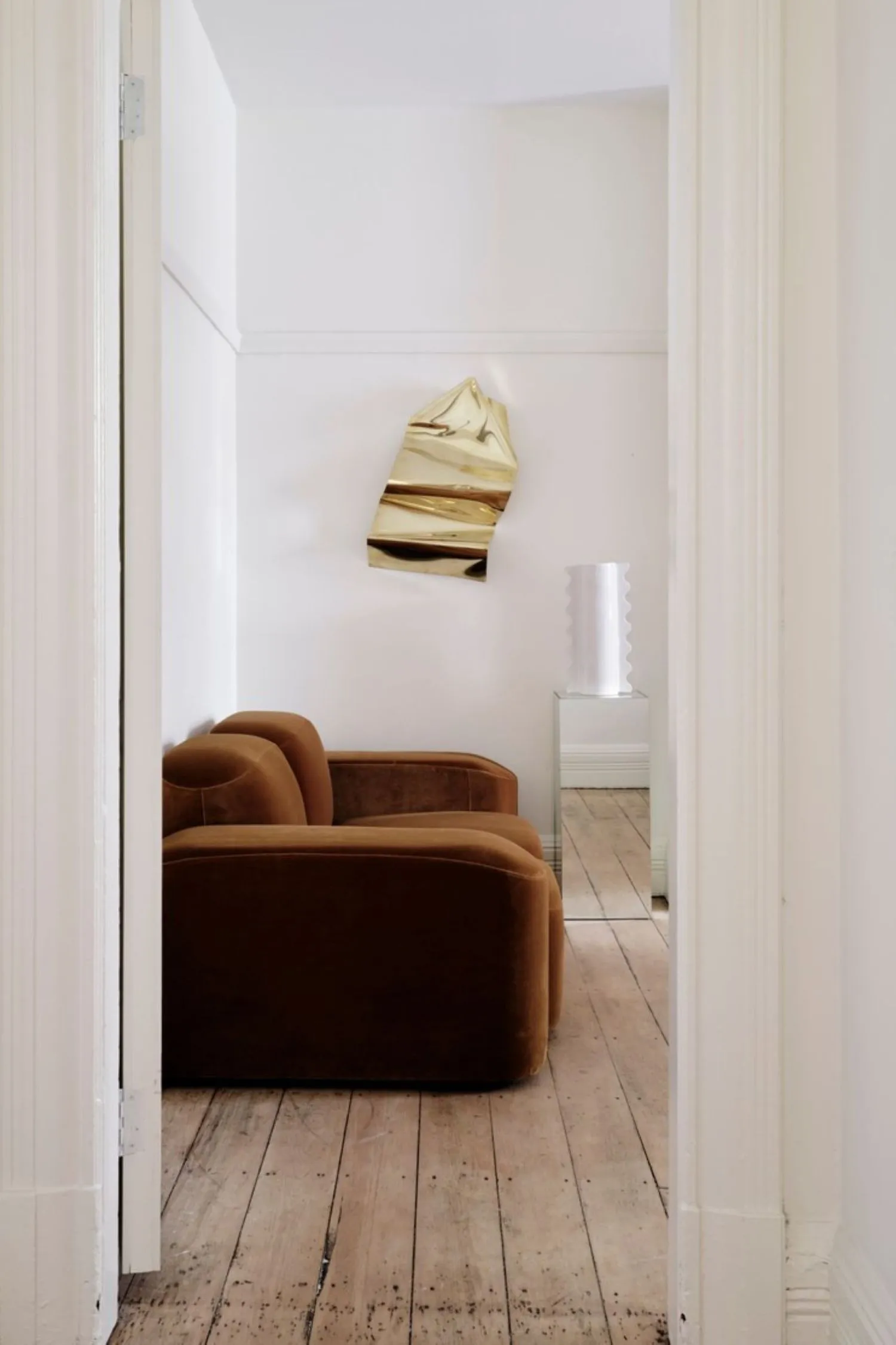
And, we couldn’t talk about stunning natural palettes without mentioning Solara by Sage & Cove Interiors. With warm woods, tonal pavers, and natural fibres, elegant rooms effortlessly reflect the Mocha Mousse aesthetic and build the Mediterranean oasis with a slice of luxury.
Design: Sage & Cover Interiors
Design: Sage & Cove Interiors
Ready to build your next mood board in Mocha Mousse tones? We’ve got everything you need in our product library, and you can bring the gorgeous colour palette to life in our mood board tool and Project Studio.