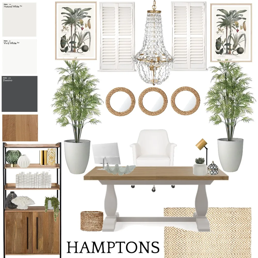
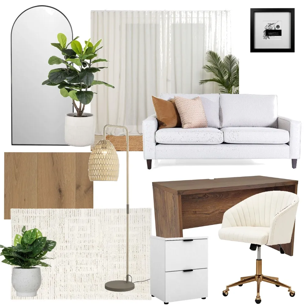
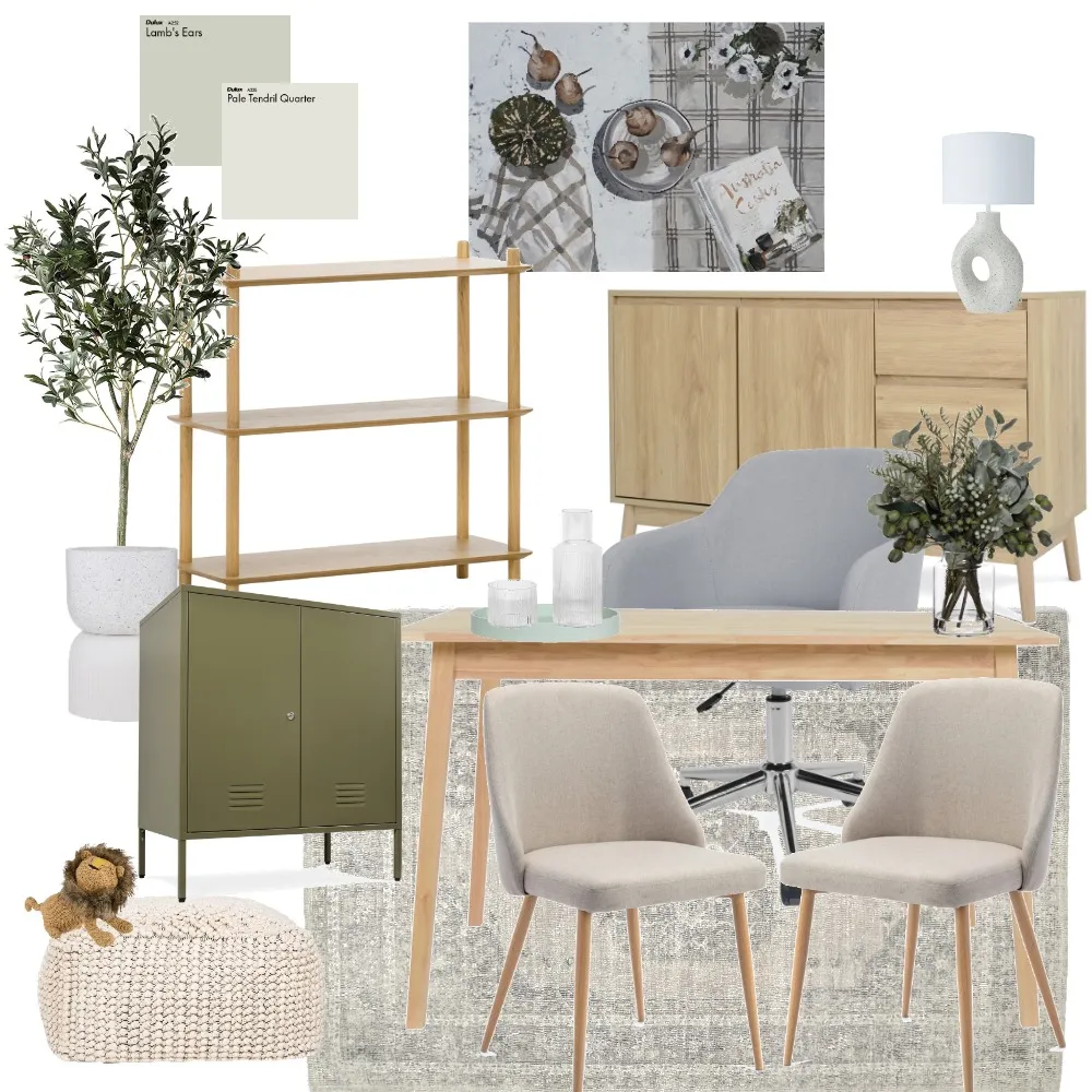
Interiors
Study Styling Three Different Ways - Dulux Colour Crush with Julia Green
Header Image Photographer: Armelle Habib
Header Image Styling: Julia Green
It’s pretty safe to say that we’ve all been spending a lot more time in our home offices than usual. Whether you’ve transformed your guest bedroom into a study or have set up a study nook in your dining room (opposite to the pile of washing and kids toys we’re sure), working from home in some capacity has quickly become the reality for many of us. It really has never been a better time to put some energy and effort into your home office setup (after all, it is where you spend majority of the week). Creating a space that is inviting, calming, and comfortable is crucial when it comes to planning and styling your study. Including design elements that make you feel happy, productive, and comfortable is so important to ensure you are getting the most out of your day and also enjoying yourself while doing so. Andrea Lucena-Orr, Dulux Colour and Communications Manager explains, “We all need different things from our study/home office, depending on the type of work we do – you may want it be a serene spot where you won’t get distracted or an energising and uplifting one that inspires creativity,” she says. “This is where colour comes in; if your study is drab and lifeless, a lick of paint is the fastest, cheapest and most effective way to switch up the mood and make it a space you’ll love.” And that’s one of the things we love most about design – the fact that it can be accommodating to various needs and there is no one-size-fits-all approach.
To follow on from the Trending Colour Palettes article we did that showcased Dulux’s colour forecast for 2021, we couldn’t help but share their latest collaboration with interior stylist, Julia Green from Greenhouse Interiors. Dulux worked with Julia who created three different contemporary looks for a study. This is perfect if you’re looking for inspiration to revamp your study but aren’t too sure where to begin. While each look is different in aesthetic, a few things remain consistent through them all. “With each look, we fully committed to the colour palette, carrying it through from the walls and artwork to décor items in order to give it a curated and intentional feel, paired with a warm white on the ceiling for cosiness. And we were careful not to overfill the room – allowing plenty of breathing space which can make a room feel calm.”
The first look took inspiration from Dulux’s Reset colour palette. The walls were painted in a soft grey-mauve, Dulux Wash&Wear in Aura, and the ceiling a warm white, Dulux Ceiling White in Natural White (one of our favourite picks). She then built upon this palette by adding hints of pink clay and punches of terraccota throughout the artwork and accessories. “These colours will brighten your outlook without being a distraction – the perfect tones to surround yourself with if you’re in the business of ideas,” says Green. “There’s an eclectic feel to this palette, so we had fun mixing old and new – a graphic, contemporary artwork and a modern lamp sit alongside a traditional patterned rug and a rustic style desk with trestle legs. A scheme like this calls for natural textures so bring in touches of timber, leather, and wool”. Don't be afraid to add pops of colour into your study. It's a known fact that colours actually change your mood. Choosing colours that make you feel happy may actually have a positive impact on your time spent in your style. A great way to introduce colour into your home office could be through artwork, a rug, or styling accessories.
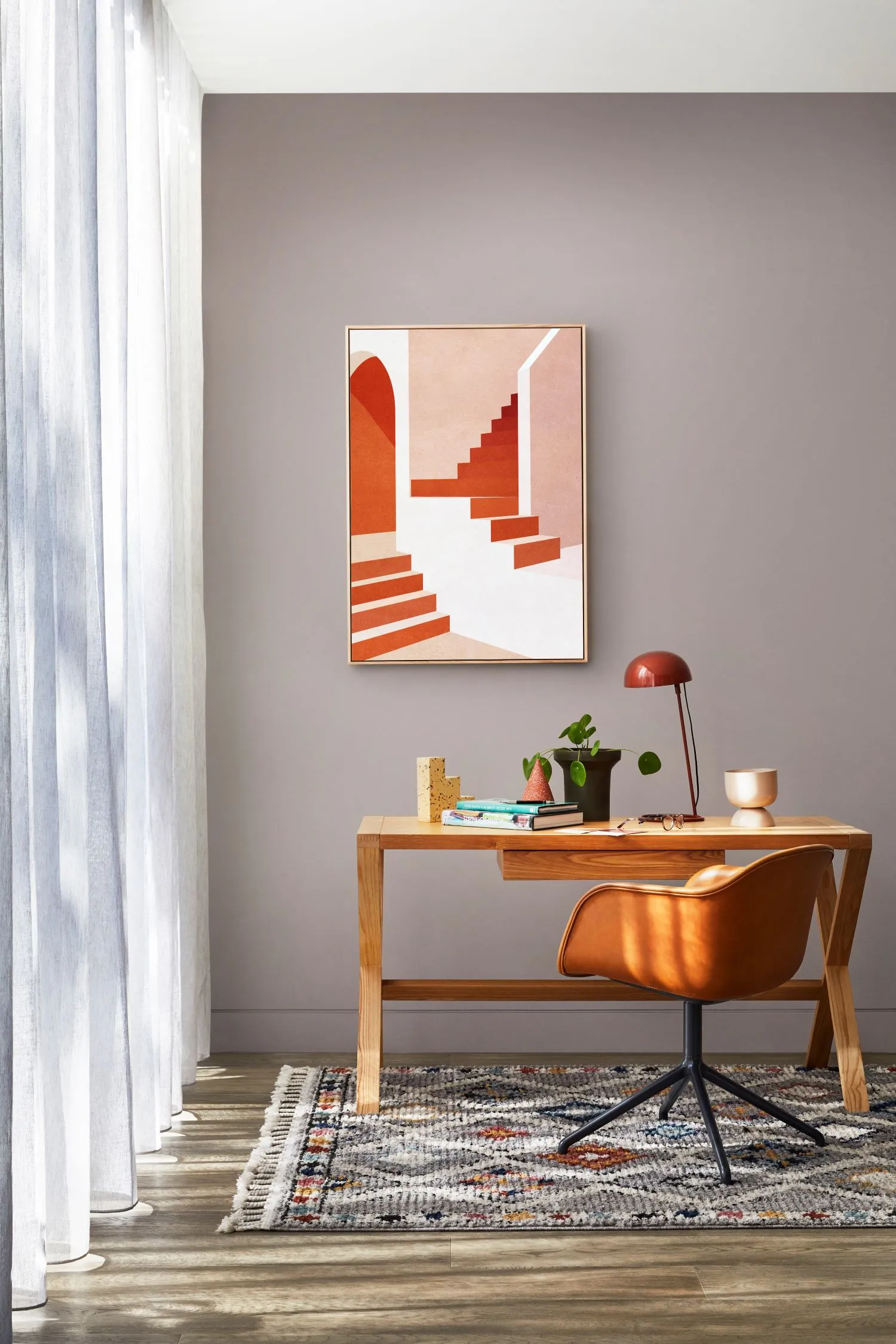 Image Credit: Dulux Australia Colour Forecast 2021. Stylist: Julia Green. Photographer: Armelle Habib. Staircase in Pink Limited Edition Print by Charlotte Taylor via Greenhouse Interiors
The second palette was focused on creating a calming feel and took its inspiration from Dulux’s Retreat palette. This was created by painting the back feature wall a rich, oceanic blue, Dulux Wash&Wear Five Fingers Peninsula. Green paired this with a warm white, Dulux Ceiling White in Whisper White on the ceiling. “Bold colour contrasts generally energise a room, but there’s a lovely muddiness to this blue that makes it feel tranquil and relaxed. It’s a classic scheme that would work beautifully in a traditional or contemporary home,” she says. Green completed the look with a traditional writing bureau in dark timber, an inspiring artwork, and a zebra-print rug. “When you’re styling your workspace, don’t be afraid to bring in pieces from other rooms, such as a rug or chair – you’ll find it personalises the space and makes it more dynamic,” she says. To compliment this relaxing and soothing palette, a good introduction to include in your study would be indoor greenery. Indoor plants not only add a fresh and rejuvenating feel, but they also make you feel like you are outdoors (which may be nice if your study at home has no windows or is situated inside your dining room). This could look like getting a small plant in a pot and placing it on your desk. Or if you're feeling a bit more adventurous you could grab yourself some large indoor pots and plant some taller indoor plants.
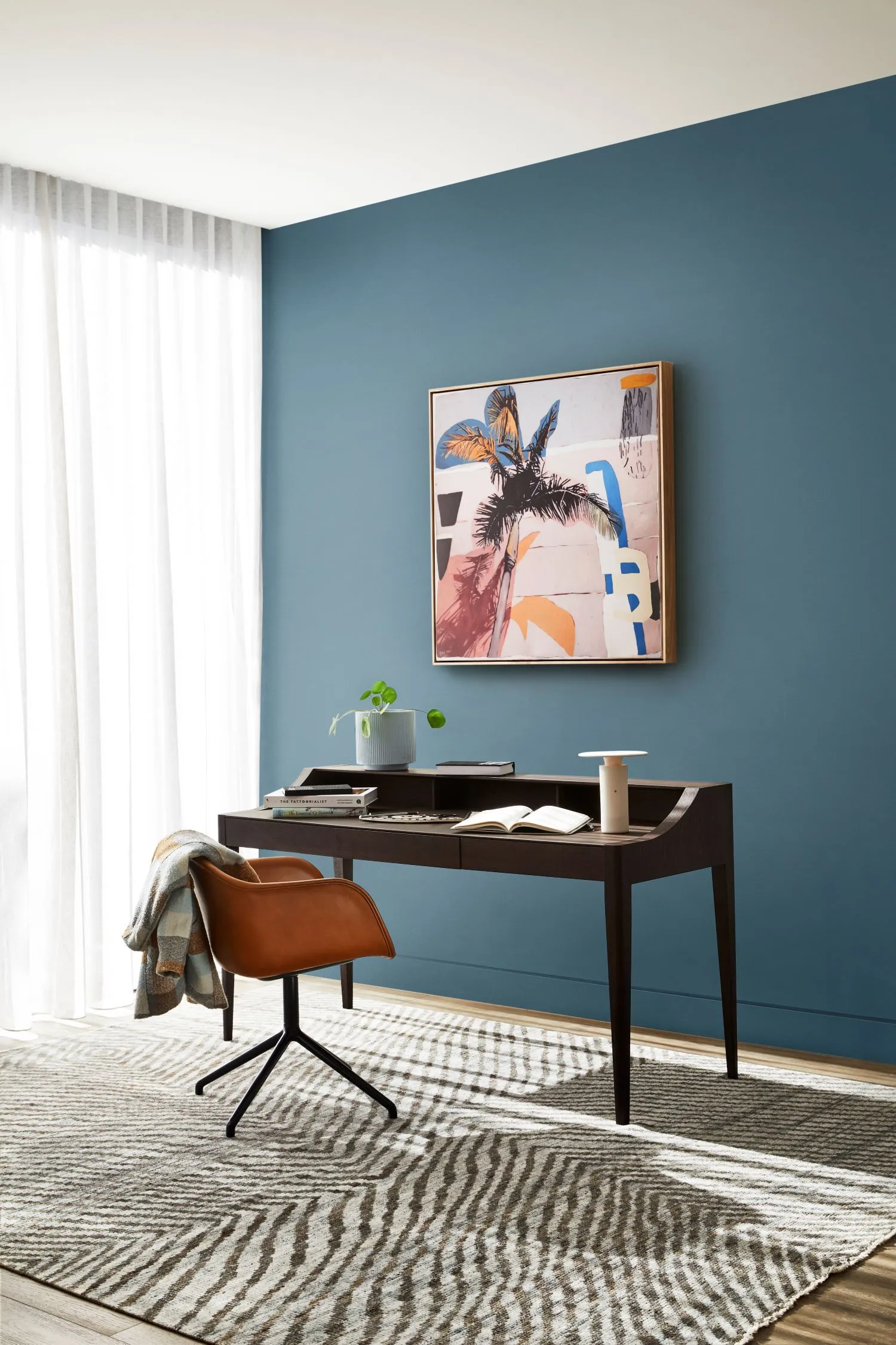 Image Credit: Dulux Australia Colour Forecast 2021. Stylist: Julia Green. Photographer: Armelle Habib. Greenhouse Interiors: Georgie Wilson, ‘Caramel Sunday Print’. Available via Greenhouse Interiors
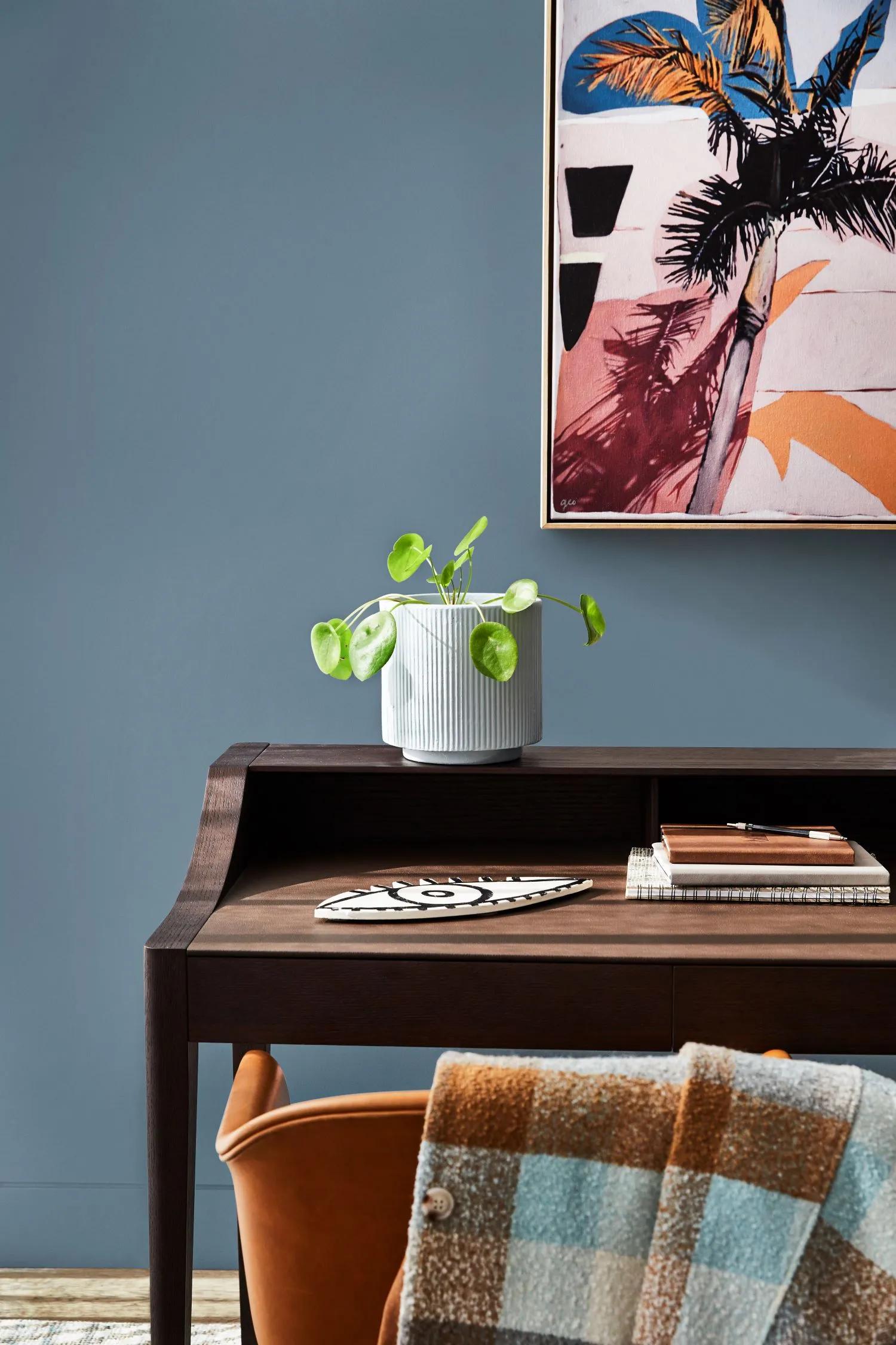 Image Credit: Dulux Australia Colour Forecast 2021. Stylist: Julia Green. Photographer: Armelle Habib. Greenhouse Interiors: Georgie Wilson, 'Caramel Sunday Print'. Available via Greenhouse Interiors
The third scheme was created from Dulux’s Nourish colour palette. Green created this look by layering warm and earthy tones. “Layering similar tones like we’ve done here creates a nurturing, comforting feel – you could imagine happily working here for long stretches,” says Green. “Rich earthy neutrals are also easy to work with and integrate beautifully with the warm whites many of us already have in our homes, as well as the natural materials such as timber and leather we’re seeing so much of.” For this look, the walls are painted in Dulux Wash&Wear Morocco Tan and Dulx Ceiling White in White Exchange Half. This was paired with tonal shades of tan and clay in the artwork, rug, and furniture. Texture was introduced throughout the studying through the rattan screen and desk chair. Adding texture into your space really helps give it dimension and really brings it to life. The way you could do this is by adding various textured cushions, woven baskets, and other decorative items such as glass vases or ceramics.
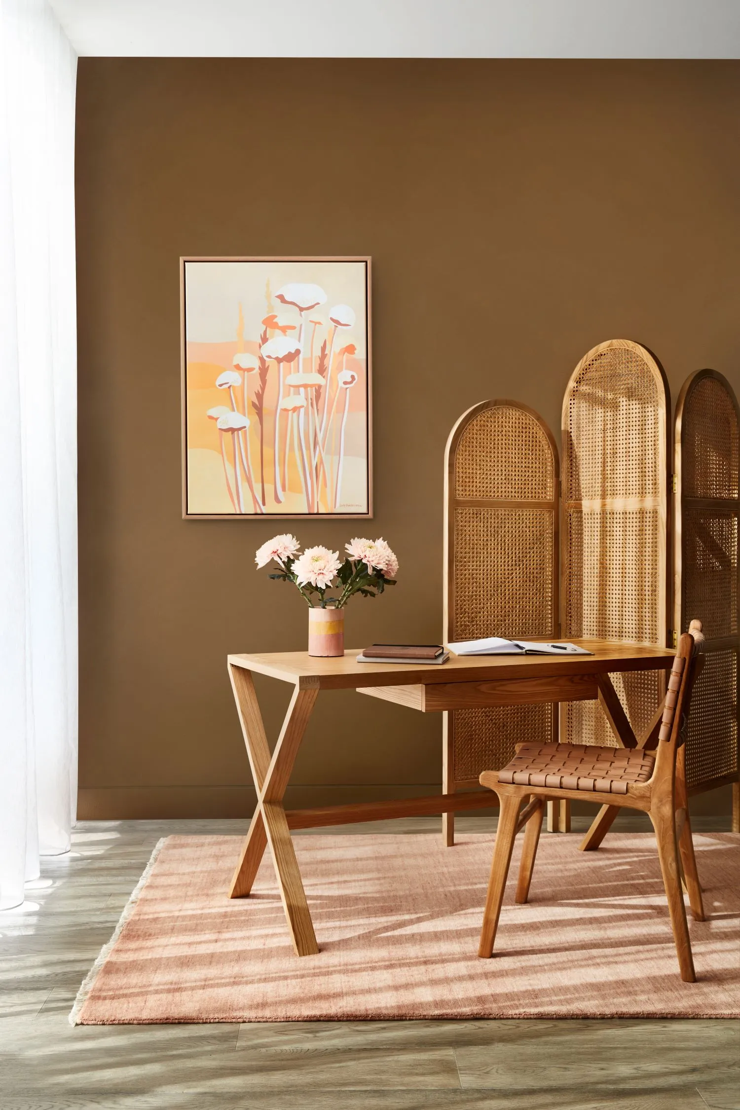 Image Credit: Dulux Australia Colour Forecast 2021. Stylist: Julia Green. Photographer: Armelle Habib. Greenhouse Interiors: 'Joshua Tree Flowers' Print. Available via Greenhouse Interiors
If that hasn’t inspired you to give your study or home office some love then we’re not too sure what will. To wrap up, we’ve rounded up Julia’s top study styling tips:
Consider mood - Choose colours to suit the mood you want to create – warm tones will create a cosy, nurturing feel (great for a teen study), while brighter hues are energising and inspiring – ideal for creative thinking.
Personalise - Family photographs and mementos from your travels can add character to your study and make it feel more welcoming.
Buy quality - A comfortable and supportive office chair and an adjustable desk lamp that allows you to see what you’re typing or writing are must-haves for a home office.
Greenery - Add plants or fresh flowers to purify the air and provide a connection to nature.
And don’t forget that you can create your own study mood board here. To inspire you, we’ve rounded up a few of our favourite study mood boards. You can view them below.