The Latest
Introducing the Unitex x Emma Blomfield Rug Collection
In Partnership With: Unitex
Style Sourcebook Profile: Unitex
The Unitex x Emma Blomfield Rug Collection has arrived, and we’re so excited to see how Unitex Rugs’s latest collection will elevate your mood board projects with its signature blend of practicality and sophisticated style. Featuring delicate motifs, soft pebble textures and elegant designs in a serene palette of moss green, duck egg blue and soft neutrals, the collection has been designed to harmonise effortlessly with contemporary interiors.
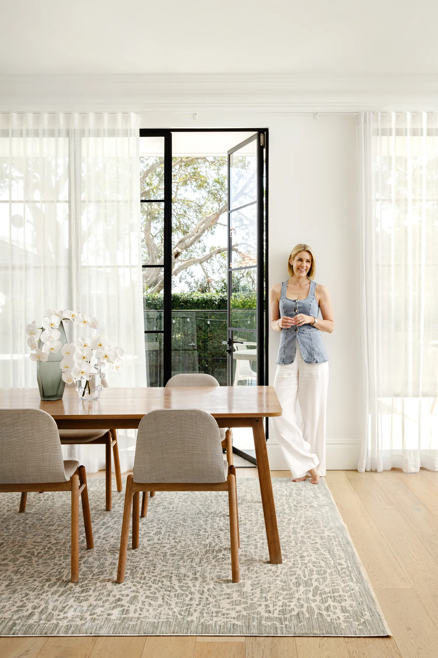
Created in collaboration with Australian Interior Designer, author and founder of EB Studio, Emma Blomfield, the range reflects Emma’s relaxed yet refined design philosophy. Known for her timeless approach to colour, pattern and approachable interiors, Emma has crafted a collection that feels both versatile and thoughtfully layered.
Luckily for us here at Style Sourcebook, Emma lets us in on her styling secrets, from moving into her new home to creating mood boards and sharing her favourite pieces from the collection. We sat down with Emma to hear about the inspiration behind the range, the process of bringing it to life, and how you can incorporate these pieces into your own spaces and projects.
Hi Emma, congrats on your new collection with Unitex! Firstly, can you tell us a bit about the inspiration for the new rug collection and the collaboration with Unitex Rugs?
Thank you! This collection has been nearly a year in the making, so it feels incredibly special to finally share it.
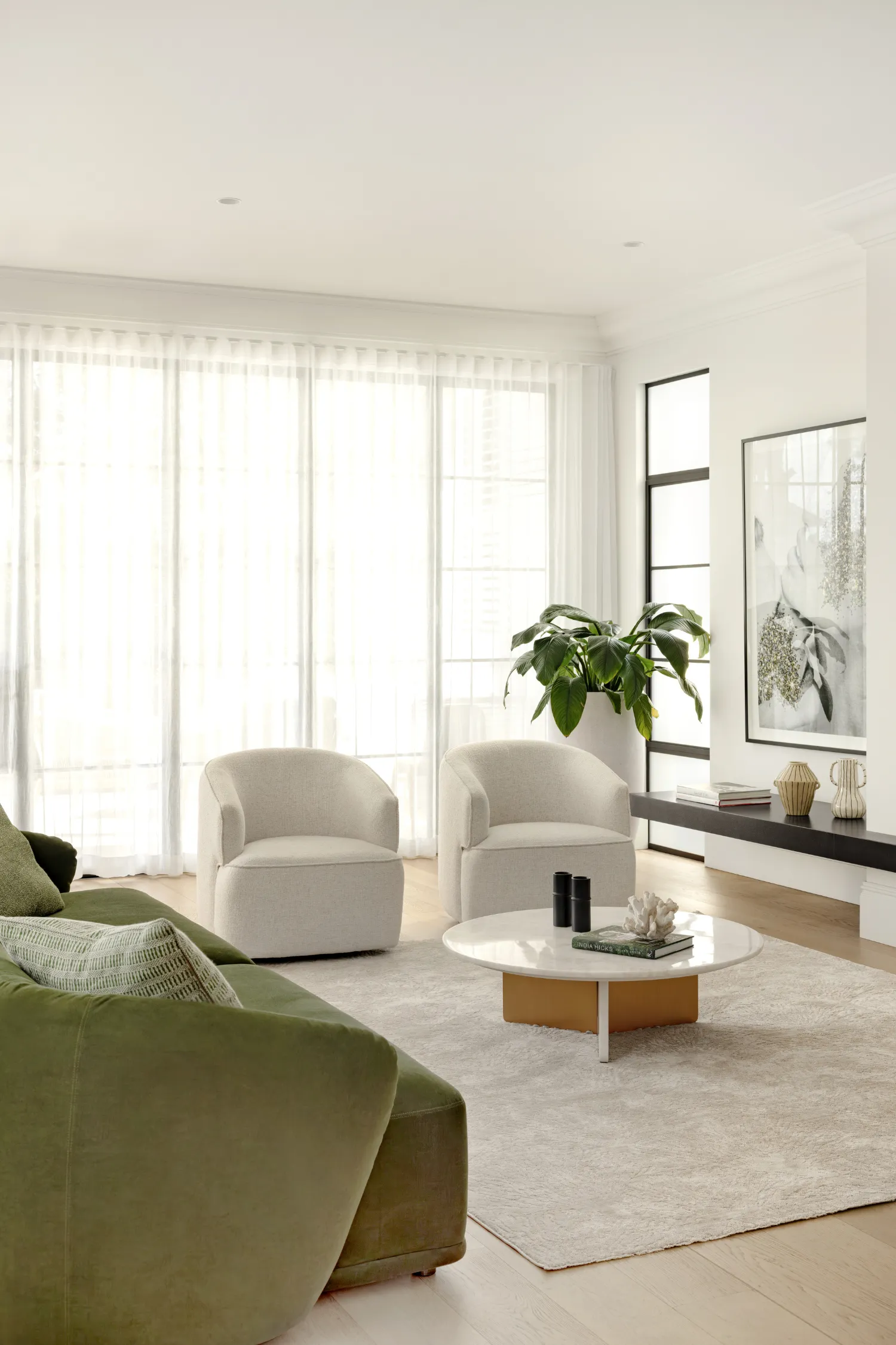
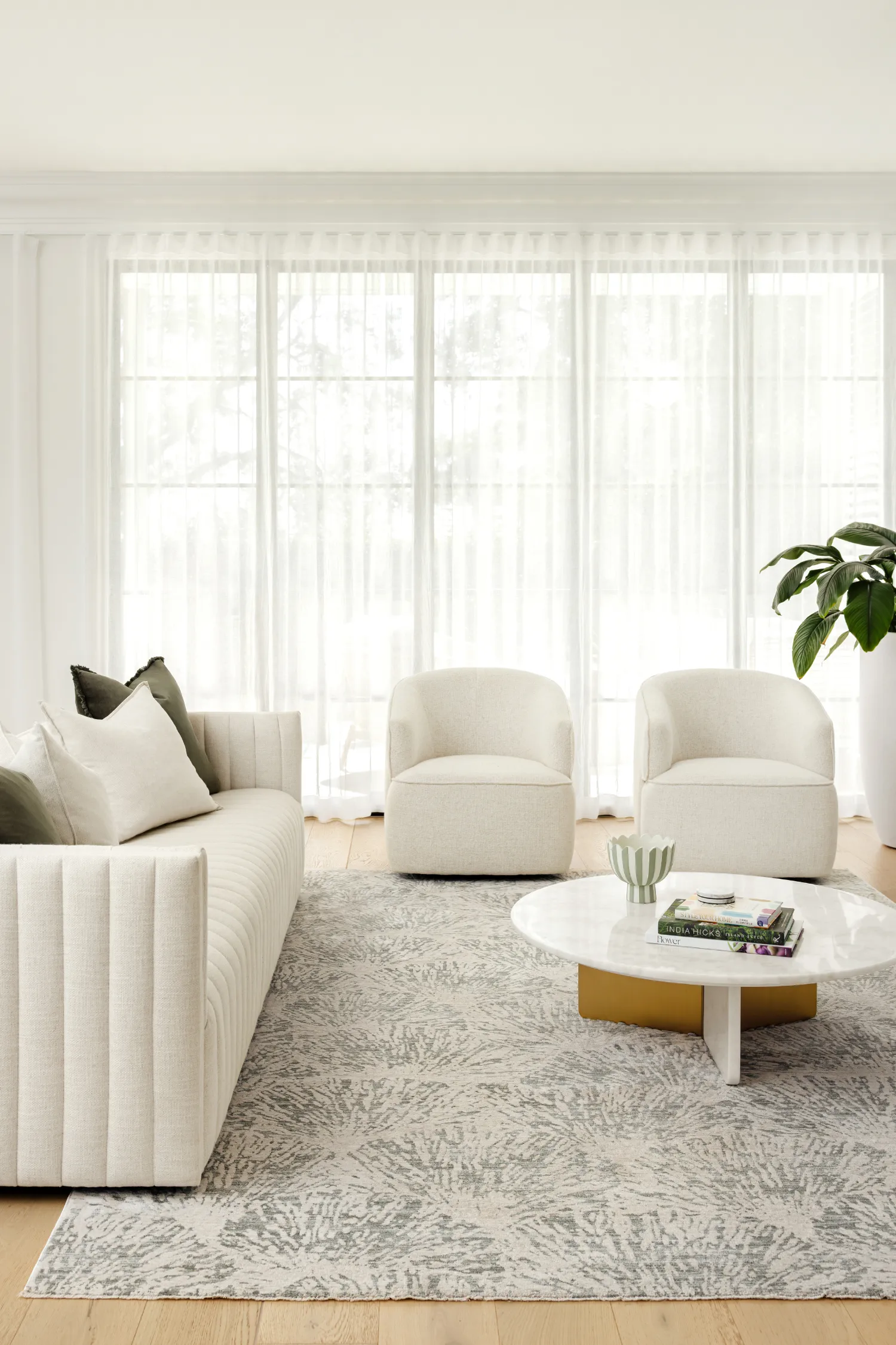
The inspiration really came from the kinds of homes we design every day at EB Studio. Layered, relaxed spaces that feel calm but still considered. I wanted to create rugs that brought calm colours, soft patterns and beautiful texture into a room without overpowering it. The palette of moss green, duck egg blue and warm sandy neutrals reflects shades I am constantly drawn to in my projects.
Working with Unitex felt like such a natural partnership having specified their rugs for over 15 years, so there is a deep understanding of our style and their product ranges. They understand how I work and how I think about interiors, not just how something looks, but how it performs in real homes. The result is a collection that feels practical, versatile and quietly sophisticated.
The new collection will look stunning across SSB mood boards! Could you give us some mood board tips for our SSB renovators and designers when using the rugs in the planning process?
I will generally always start with the rug on a mood board. It is the anchor. Once you choose the rug, it becomes much easier to layer everything else around it.
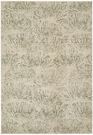
For example, if you are using something like Plume Moss, pull that soft green into a fabric swatch, artwork or even a ceramic accessory to create cohesion. With Veil Blue, you might echo that duck egg tone in a stripe or a subtle cushion detail.
“My biggest tip is to treat the rug as a foundation rather than an afterthought. Consider scale carefully on your board too. Make sure the rug feels proportionate to the furniture layout you are designing. And do not be afraid to layer texture. Linen upholstery, timber finishes and brushed metals all help rugs come alive.”
Emma Blomfield, Interior Designer and Author
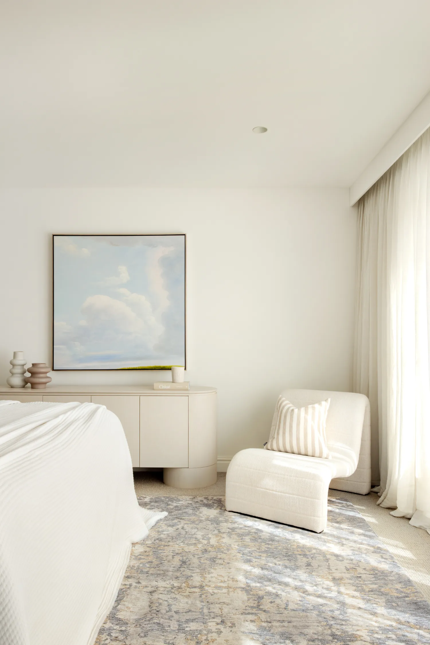
We’re obsessed with the serene palette of moss green, duck egg blue, and neutral tones. How would you recommend these shades be used to create a calm yet layered interior?
It is all about restraint and repetition in my opinion!
Moss green works beautifully when used sparingly but intentionally. Perhaps in a rug like Plume Moss, then repeated in foliage, a velvet cushion or a piece of art. It instantly brings a connection to nature and warmth.
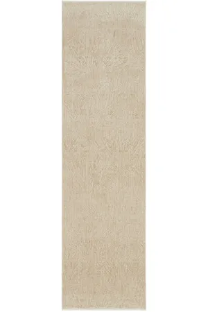
Duck egg blue, as seen in Rogue Mist or Veil Blue, is such a gentle way to introduce colour without overwhelming a space. It pairs beautifully with warm timbers and creamy upholstery.
And neutrals are never just beige. Layering warm oat tones with stone, sand and soft grey creates depth. The trick is mixing textures within that neutral palette so the room feels interesting but still serene.
Do you have a favourite piece in the collection? How would you personally style it?
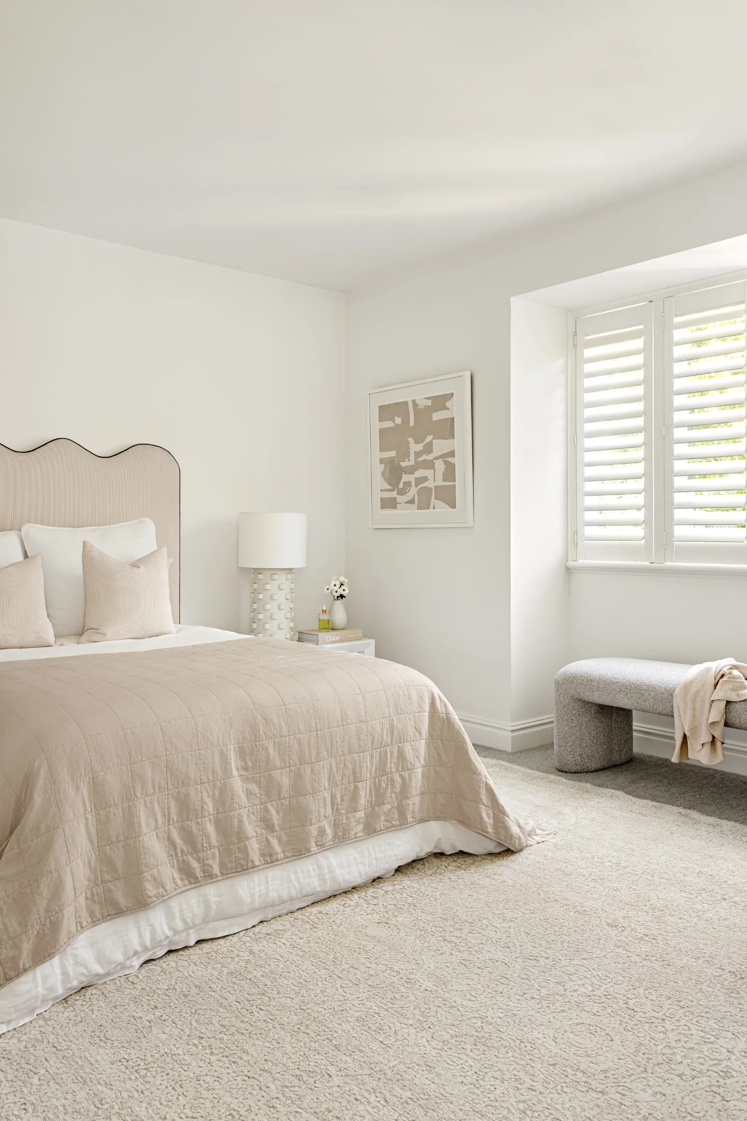
That is always the hardest question. But I do have a soft spot for Veil Blue. There is something about the delicate, lacy motif that feels timeless and romantic without being overly decorative.
I would style it in a bedroom with a soft upholstered bedhead, relaxed linen bedding and layered bedside lighting. It also works beautifully in homes that blend traditional architecture with more contemporary furniture. It adds that subtle sense of heritage without feeling formal.
We’ve heard you moved house! Exciting - could you tell us how you styled your home and any tips you’d give the SSB community from this experience?
Yes. Moving house is always equal parts exciting and chaotic. I’m deep in the chaos at the moment!
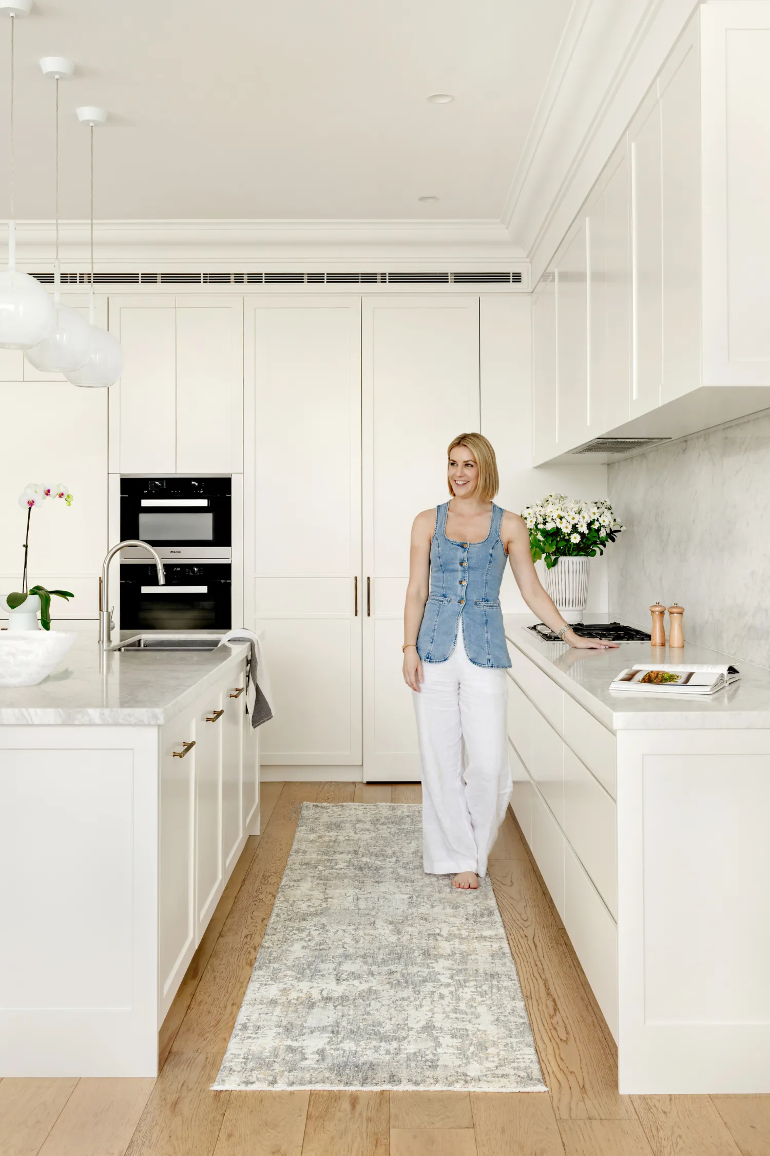
What it reinforced for me is how important foundational pieces are. I focused first on the rugs, key furniture pieces and cabinetry. These are the elements that really shape how a space feels. Styling and smaller décor came later.
“My biggest tip for the SSB community is do not rush to fill every corner. Live in the space for a while. Notice how the light moves, how you use each room and where you naturally gather.”
Emma Blomfield, Interior Designer and Author
What about some styling advice for the rugs - what do you envision when you imagine them across people's designs?
I imagine them grounding relaxed living rooms, softening bedrooms and defining dining zones in open plan homes.
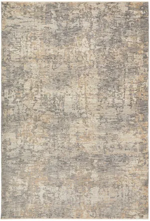
For something like Haze Slate, I see it anchoring a contemporary living space with warm timber and stone finishes. Rogue Linen works beautifully in more minimal interiors where texture does the talking.
I would encourage designers to think about balance. If your furniture is quite structured, choose a rug with a softer, more organic motif. If your scheme is very neutral, consider one of the subtle colourways to add depth.
Overall, how can designers use these rugs to create cohesion across open-plan spaces?
Consistency is key.
In open plan homes, I often recommend selecting rugs from the same collection but in complementary colourways. For example, you might use Plume Oat in the living zone and a coordinating tone like Rogue Linen in the adjacent dining area. There is visual harmony, but enough variation to define each space.
Repeating tones across upholstery, artwork and joinery also helps tie everything together. Rugs are brilliant zoning tools. They visually anchor the furniture in the space while maintaining flow across the broader space.
How do you hope people feel when they step onto one of these rugs for the first time?
I hope they feel an immediate sense of calm.
There is something very grounding about a soft rug underfoot. My wish is that these pieces help create homes that feel inviting, comfortable and quietly beautiful. Spaces where people can truly relax and where life unfolds naturally.
If someone steps onto one of these rugs and feels like their home has finally come together, then we have done our job.
Ready to use the design tips for your projects using the Unitex x Emma Blomfield rug collection? Find these Unitex rugs in our product library and bring your projects to life through our mood board tool and Project Studio!