The Latest
Open the Door to Colour | Apply Dulux Colour Forecast 2026 To Corinthian Doors
In Partnership With: Corinthian Doors
Style Sourcebook Profile: Corinthian Doors
It’s time to open the door to colour with a palette combination that suits you. From the Balmoral range to the Roma collection and beyond, Corinthian Doors elevate mood boards with doors that shape the mood of the home. What better way to further complement the mood of the home than with the Dulux Colour Forecast 2026?
Whether you’re drawn to the warm, sunlit calm of Elemental®, the nostalgic richness of Evoke®, or the airy optimism of Ethereal®, you can apply the Dulux Colour Forecast 2026 to any of Corinthian Doors’ collections.
Let’s bring these palettes into your projects and delve into styling advice that brings character into interiors and entrance doors through colour. The best place to set the mood of the home is where every story starts: the door.
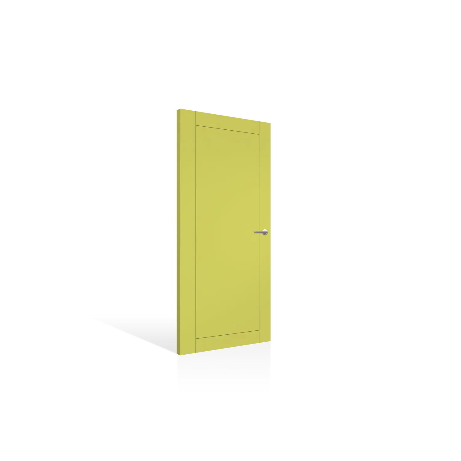
Colour Featured: Dulux Palo Verde®
Doors in Elemental | Grounded and Calm Interiors and Exteriors
Think soft sunlight over stone, sand, and timber. Elemental® embraces earthy neutrals and organic warmth, and the Balmoral PBAL 10 in Dulux Caramel Sundae® captures it beautifully. The timeless arches on the Balmoral collection suit this colour in complete elegance. Its golden undertone pairs perfectly with natural materials like oak, travertine, or rattan, adding a gentle richness that feels both timeless and new.
Alongside it, the Peninsula PPEN 2G Entrance Door in Dulux Hog Bristle Quarter® brings a creamy elegance ideal for homes that lean into effortless minimalism. Try this shade against white brick or warm-toned render for a soft, tonal palette that exudes quiet luxury.
Colour styling tip: Pair doors in Dulux Elemental® colours with textural layering, such as woven rugs, clay ceramics, brushed brass hardware, and soft linen upholstery. Keep your mood board tactile and grounded so that it allows this palette to shine through subtly.
“Lighting design plays a massive role. Most internal doors are in hallways, which often have the least light in the whole home. Sometimes just adding colour there gives interest, otherwise it can all look a bit same-same.”
Andrea Lucena-Orr, Dulux Colour and Communications Manager
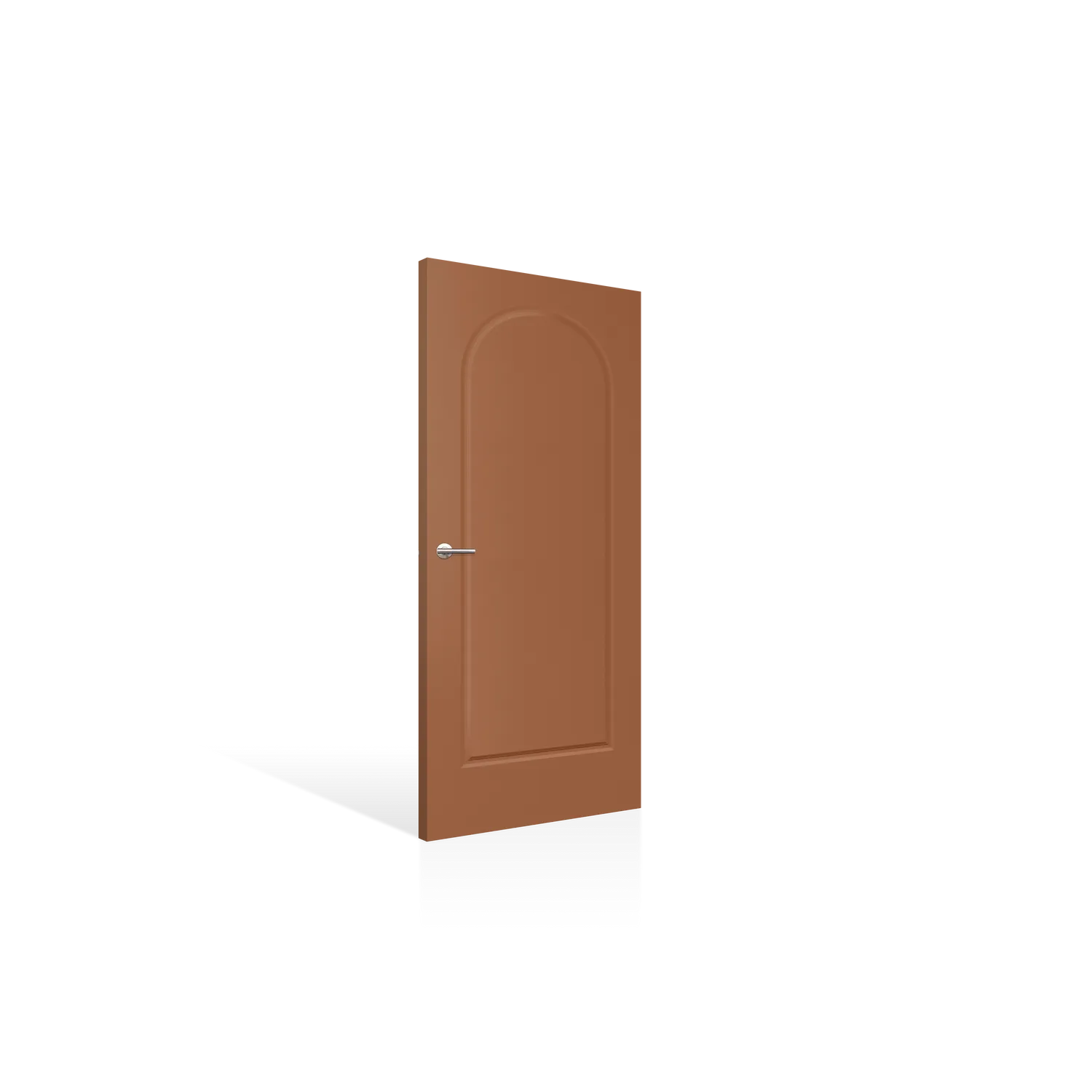
Balmoral PBAL 10 in Dulux Caramel Sundae®
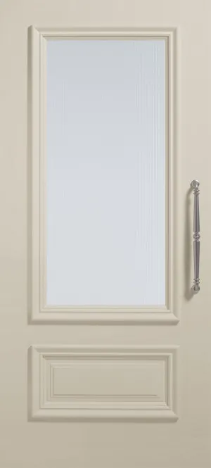
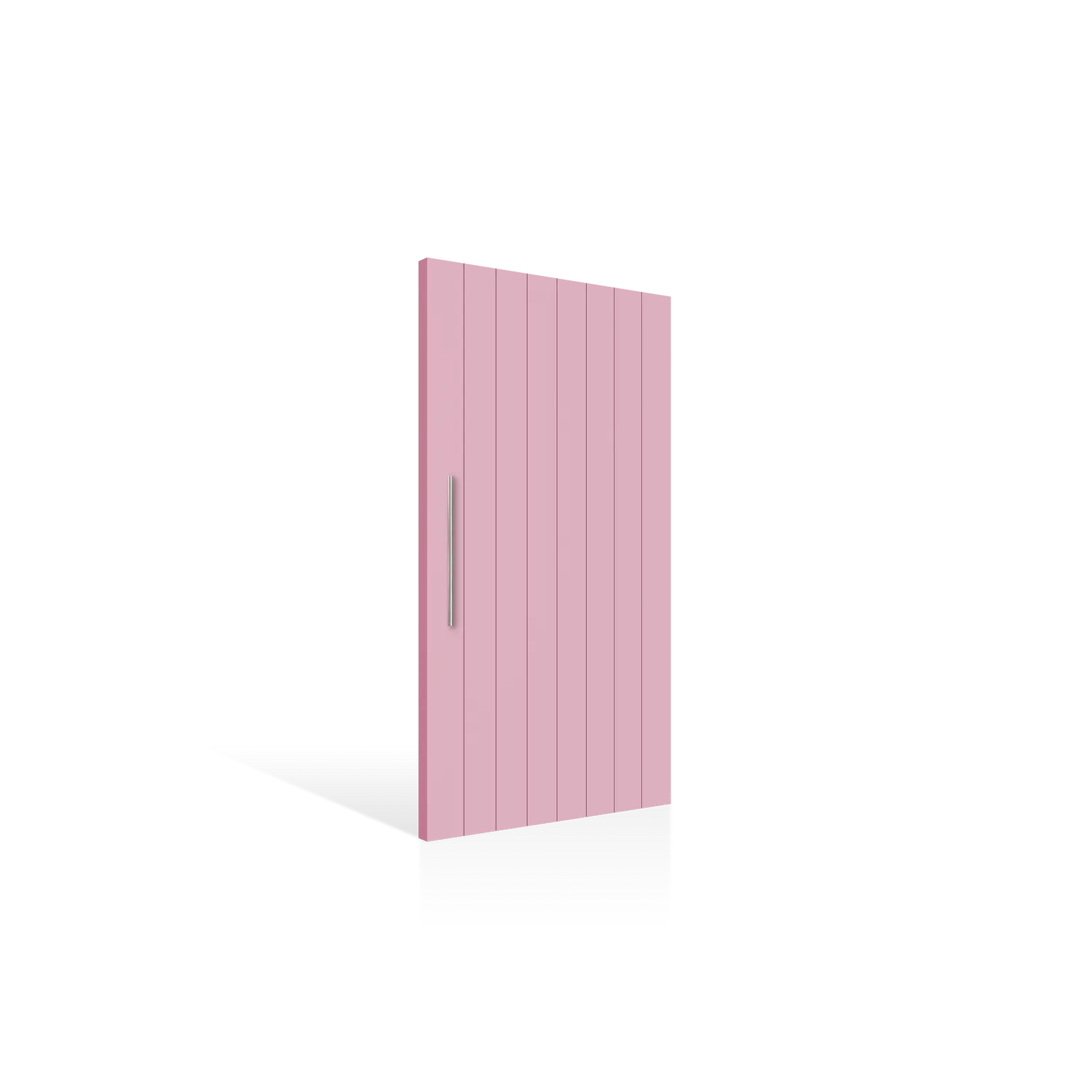
Peninsula PPEN 2G in Dulux Hog Bristle® Quarter
Doors in Evoke | Bold Interiors and Exteriors with Elevated Personality
For those who crave colour with depth and classical styles, Evoke® is your palette. These hues celebrate emotion and storytelling, including tones that feel familiar yet distinctly modern.
The Endura FLAR12SST Entrance Door in Dulux Deep Aqua® brings instant vibrancy and character, perfect for statement front doors or moody interior entrance moments. Pair it with mid-century-inspired furniture, aged brass details, and natural light to balance its intensity.
“An entrance door allows you to bring your own personality to the front of the home. I can recall one stylist who repainted her front door for every season. It was quick, easy, and I thought it an easy transformation that reflects the seasons and individualises a home.”
Andrea Lucena-Orr, Dulux Colour and Communications Manager
For a lush, botanical twist, Deco 10S in Dulux Succulent® offers deep sophistication. This shade feels both nostalgic and fresh, perfectly demonstrating where vintage revival meets modern calm. Try it on interior doors surrounded by textured plaster walls or paired with terrazzo flooring and walnut joinery for a rich, layered aesthetic.
Colour styling tip: Use Evoke® tones to create contrast. Pair deep greens and aquas with creamy trims, warm woods, or retro metallics. On mood boards, anchor these hues beside velvet, marble, or dark stone for a luxe finish.

Endura FLAR12SST in Dulux Deep Aqua®
Deco 10s in Dulux Succulent®
Doors in Ethereal | Light and Optimistic Interiors and Exteriors
Ethereal® is the dreamer’s palette, with soft pastels and gentle neutrals that calm and uplift. It’s all about light, air, and emotion.
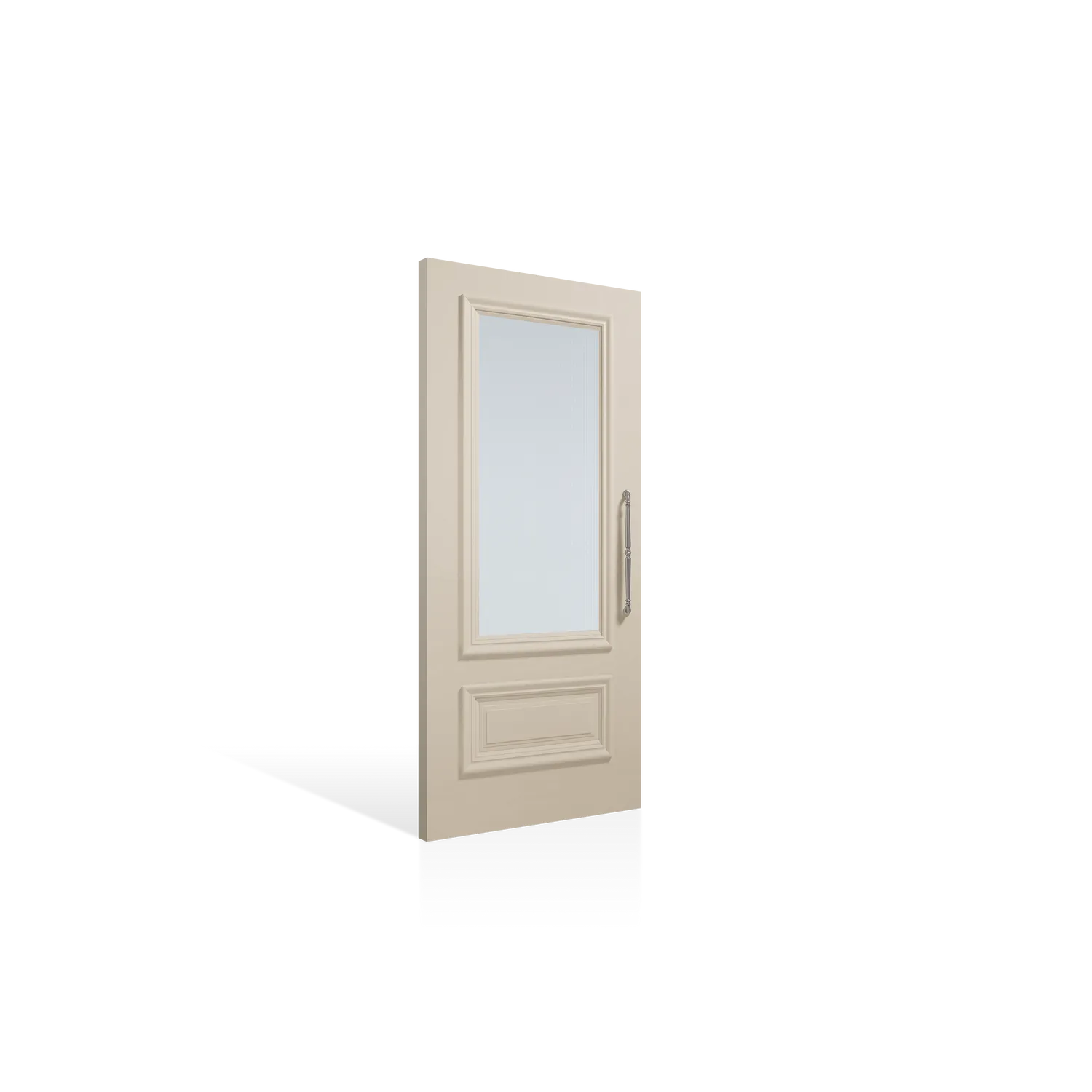
The Roma PROM 1 in Dulux Aroma® embodies effortless ease with a creamy off-white that works beautifully in coastal, minimal, or contemporary interiors. Pair it with sheer curtains, pale timbers, and terrazzo for a look that feels timelessly serene.
Then, there’s the Deco WS 4S Entrance Door in Dulux Kindness®: a delicate, uplifting pastel tone that’s perfect to set the positive mood at the entry of the home. Its subtle warmth glows under natural light, turning even the simplest doorway into a moment of softness.
Colour styling tip: In mood boards, pair Dulux Ethereal® doors with light-diffusing finishes like bouclé, raw ceramics, and brushed nickel. Use tonal variation across rooms for a gentle, flowing rhythm that feels restorative.
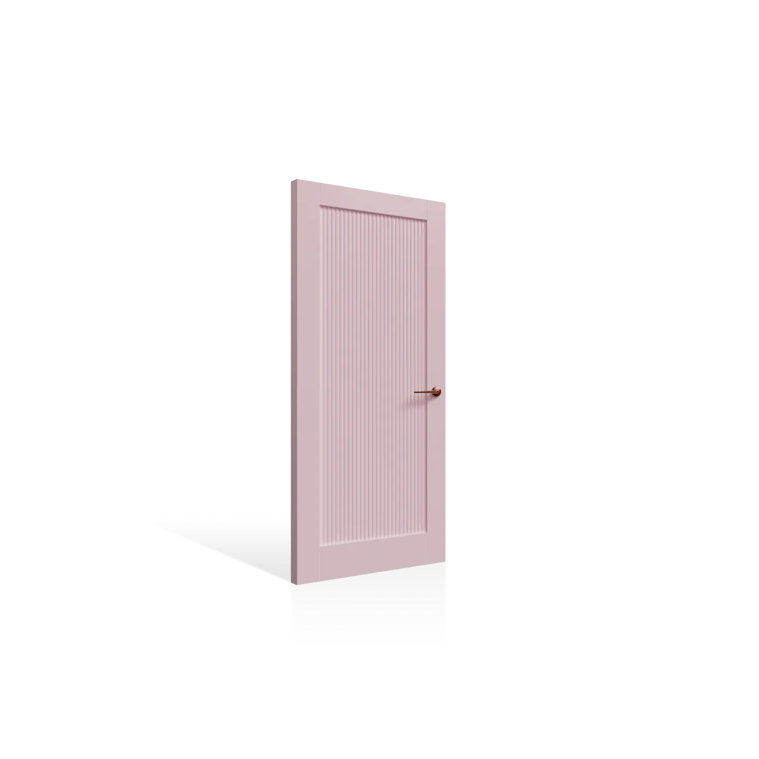
Deco WS 4S in Dulux Kindness®
Roma PROM 1 in Dulux Aroma®
Open the Door to Colour
This year, colour isn’t just for walls, but it’s for the spaces in between, too. With Corinthian Doors’ curated finishes and the Dulux Colour Forecast 2026 palettes, every door becomes a design statement that connects light, texture, and emotion.
“From a psychological perspective, colour makes a massive difference. Soft pinks are nurturing, greens are restorative, blues are tranquil. Each hue creates a different mood. That’s why it is so important to test colours, especially for doors. Especially for the front of home, your street appeal and something you come home to every day.”
Andrea Lucena-Orr, Dulux Colour and Communications Manager
So, whether you lean into the calm of Elemental®, the depth of Evoke®, or the optimism of Ethereal®, create a mood board with Corinthian Doors to open the door to colour. If you’re a design professional, bring the story of colour to life with Project Studio!